Doctoral school course: an introduction to R
Block 2: The basics of bivariate statistics
In this block, we will learn how to study two-dimensional samples in
R. We will also learn how to load external dataset in
R and to install some basic packages.
Two quantitative variables
Let us take the example of a very simple data set, the
cars dataset:
data(cars)
?cars
There is two quantitative variable: speed, in miles per
hour and dist, in feet (as indicated in the help from
R, these data were recorded one century ago). There is
certainly a link between these two variables. We can look at this by
doing a plot of one variable versus the other:
plot(cars$dist,cars$speed)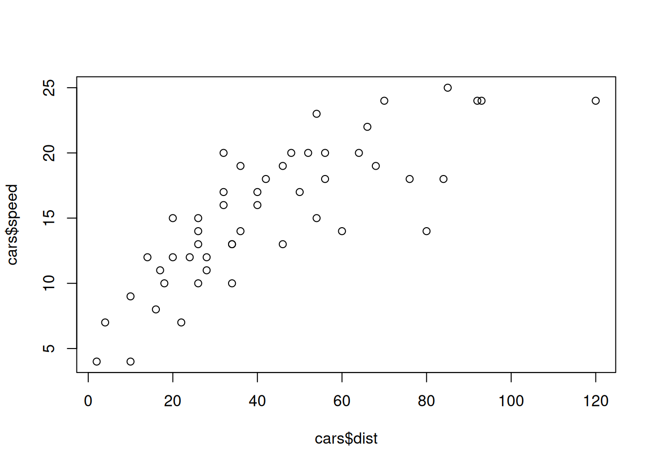
Exercise: Add a main title and the \(x-y\) labels for this plot.
The correlation coefficient
The relation does not seem to be really linear but nevertheless, we can compute the correlation coefficient, which quantify how a pair of variables are linearly related:
cor(cars$speed,cars$dist)## [1] 0.8068949Is this high ? low ? What we can say for sure is that it is positive: when positive, this means that when the speed increases, so does distance (in trend).
Recall that if we write \(y=(y_i)_{1\leq i \leq 50}\) for the car speeds, and \(x=(x_i)_{1\leq i \leq 50}\) for the car distances, we have: \[ {\rm cor(x,y)}=\frac{{\rm cov}(x,y)}{s_xs_y} \] where the covariance \({\rm cov}(x,y)\) is given by \[ \rho={\rm cov}(x,y)=\frac{1}{50}\sum_{i=1}^{50}x_iy_i-\bar{x}_{50}\bar{y}_{50} \] (the mean of the products minus the product of the means) with the means \[ \bar{x}_{50}=\frac{1}{50}\sum_{i=1}^{50}x_i,\quad \bar{y}_{50}=\frac{1}{50}\sum_{i=1}^{50}y_i \] and the standard deviation (square root of the variance) \[ s_x=\sqrt{{\rm cov}(x,x)},\quad s_y=\sqrt{{\rm cov}(y,y)}. \]
Exercise: Can you check that the the
cor function indeed compute the correlation coefficient by
implementing the above formulas ?
Recall that the correlation coefficient \(\rho\) is between \(-1\) and \(1\), and the more it is close to one, in absolute value, the more the relation between the two variables are linearly related. When it is \(0\), the two variables are said to be uncorrelated. This is a notion which is different from the one of independance (independence implies uncorrelatedness).
Linear model
I will not do here a complete course on the linear regression but I will give some elements.
At first, a quote from Wikipedia: >It concerns two-dimensional sample points with one independent variable and one dependent variable (conventionally, the x and y coordinates in a Cartesian coordinate system) and finds a linear function (a non-vertical straight line) that, as accurately as possible, predicts the dependent variable values as a function of the independent variable.
So we write, with \(n=50\) here, \[ \forall 1\leq i\leq n,\quad y_i=ax_i+b+\varepsilon_i \] where \(a\) and \(b\) are two parameters, that is two deterministic constants. The \(\varepsilon_i\) are uncorrelated random variables (and often, we assume more, that is, we assume that they are independents) that are centred (the mean, or expectation, is \(0\)) and with common variance \(\sigma^2\).
y<-cars$speed
x<-cars$dist
reg<-lm(y~x)
summary(reg)
##
## Call:
## lm(formula = y ~ x)
##
## Residuals:
## Min 1Q Median 3Q Max
## -7.5293 -2.1550 0.3615 2.4377 6.4179
##
## Coefficients:
## Estimate Std. Error t value Pr(>|t|)
## (Intercept) 8.28391 0.87438 9.474 1.44e-12 ***
## x 0.16557 0.01749 9.464 1.49e-12 ***
## ---
## Signif. codes: 0 '***' 0.001 '**' 0.01 '*' 0.05 '.' 0.1 ' ' 1
##
## Residual standard error: 3.156 on 48 degrees of freedom
## Multiple R-squared: 0.6511, Adjusted R-squared: 0.6438
## F-statistic: 89.57 on 1 and 48 DF, p-value: 1.49e-12We used the command lm to build the linear model in
order to explain \(y\) thanks to \(x\). Then the command summary
to obtain… the summary of the regression. Let us comment, partly, this
output:
Coefficients:
            Estimate Std. Error t value Pr(>|t|)
(Intercept)  8.28391    0.87438   9.474 1.44e-12 ***
x            0.16557    0.01749   9.464 1.49e-12 ***
This concerns the coeffecient \(a\) before \(x\) (the slope) and the intercept (at origin) \(b\) of the linear model. The estimated value of \(b\) is \(8.28391\). This estimated value has been obtained thanks to the construction of an estimator, that is thanks to a random variable, which have some variance and standard error, here estimate by \(0.87438\) (Std. Error column).
Les us give the formulas for the estimator of \(a\) and \(b\): \[ \hat{a}_n=\frac{{\rm cov}(x,y)}{s^2_x} \] and \[ \hat{b}_n=\bar{y}_n-\hat{a}_n\bar{x}_n. \] Notice that it means that the mean point \((\bar{x}_n,\bar{y}_n)\) belongs to the regression line given by \[ y=\hat{a}_n x+\hat{b}_n. \]
Exercise: Can you check that the the lm
function indeed compute these coefficients by implementing the above
formulas ?
The t and p-value
In the table
Coefficients:
            Estimate Std. Error t value Pr(>|t|)
(Intercept)  8.28391    0.87438   9.474 1.44e-12 ***
x            0.16557    0.01749   9.464 1.49e-12 ***
there is a column entitled t value. It corresponds to
the estimated value of the statistic associated to the test of Student
with null hypothesis: \(b=0\) for the
intercept and \(a=0\) for the
slope.
It is possible to show that \[ S=\frac{\hat{b}_n-b}{\sqrt{\hat{b}_n}} \] is distributed as a Student law with parameter \(n-2\). The variable is called a test statistic. We can effectively compute an estimation of this quantity when the unknown parameter is equal to \(0\) (that is, when the null hypothesis is true). Its value is indeed
8.28391/0.87438## [1] 9.474039This is the t-value.
Now, the question is: Is this value compatible with a Student’s law? One way to answer this question is to compute the p-value given by
n=nrow(cars)
(1-pt(9.474039,n-2))+pt(-9.474039,n-2)
## [1] 1.44067e-12Note that the keyword for the Student law in R is just
t.
As an exercise, we will do a graph to illustrate what is here computed.
Exercise: Build the following graph, illustrating
what the p-value is when the test statistic is equal to \(1.5\). You should use the
polygon function.
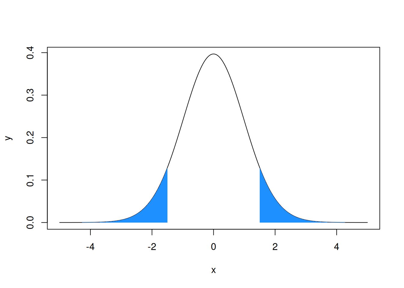
The p-value corresponds here to the probability for a random variable following a Student law with parameters \(n-2\) to be in the interval \(]-\infty,-|tvalue|]\cup[|tvalue,+\infty[\). The smaller this quantity, the less probable it is to observe such a value for the considered Student’s t-distribution, suggesting that something might be wrong in our reasoning. The issue might lie with the null hypothesis, suggesting that the intercept is statistically significantly different from zero.
Exercise: Why it is called Student law ?
Visual sum up
We can ask R to plot the regression line thanks to the
abline function :
y<-cars$speed
x<-cars$dist
plot(x,y,pch=19)
reg<-lm(y~x)
abline(reg,col="firebrick1",lwd=2)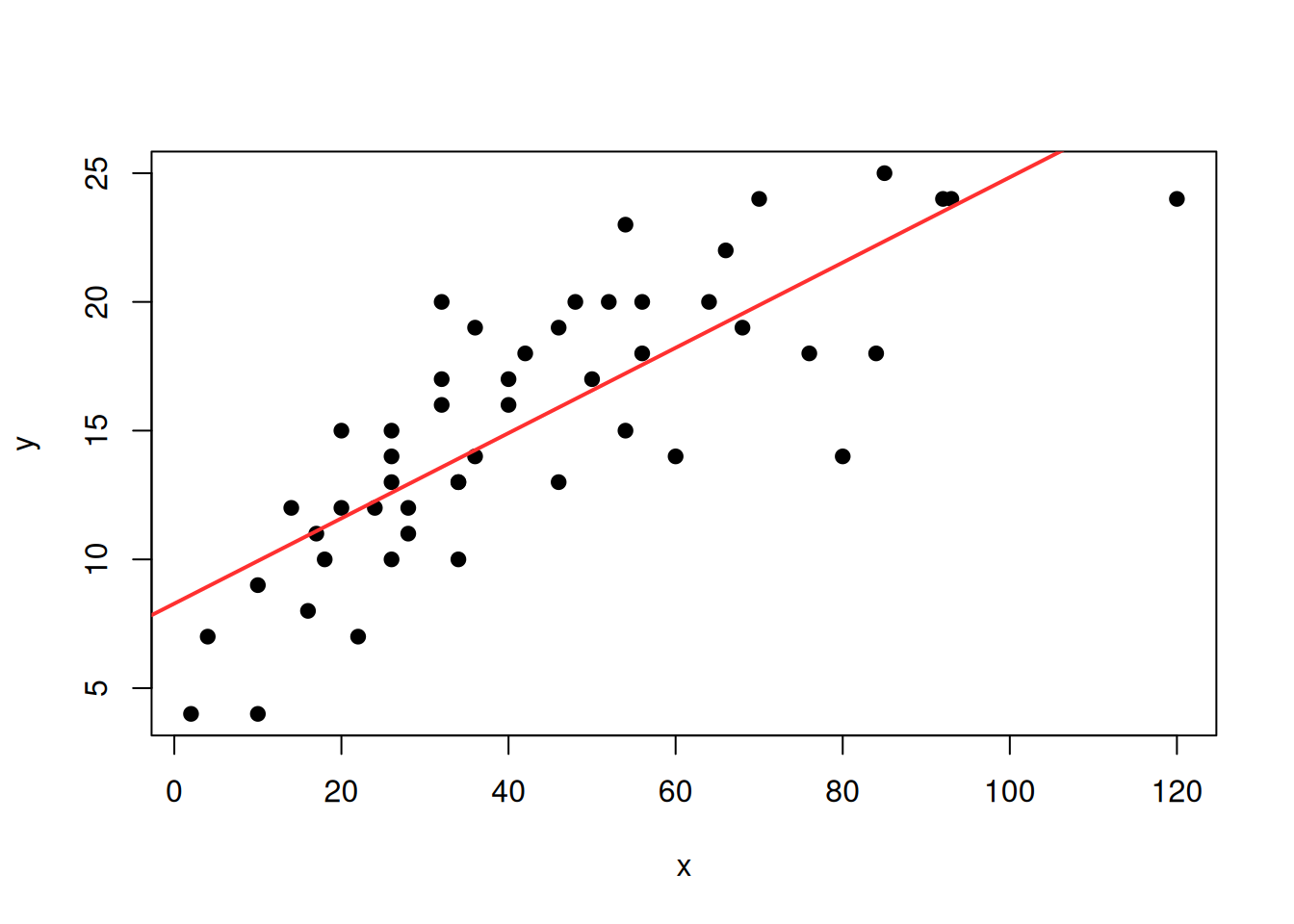
Exercise: Using the legend,
bquote and round functions, obtain the
output:
y<-cars$speed
x<-cars$dist
plot(x,y,pch=19)
reg<-lm(y~x)
abline(reg,col="firebrick1",lwd=2)
legend("bottomright",legend=bquote(rho == .(round(cor(x, y), 2))))
Exercice: Play with the abline function
to add other lines with specific slopes and intercepts.
It is possible to built the interval of prediction (at some levels)
around the prediction of the linear model thanks to the
predic.lm function:
y<-cars$speed
x<-cars$dist
plot(x,y,pch=19)
reg<-lm(y~x)
abline(reg,col="firebrick1",lwd=2)
legend("bottomright",legend=bquote(rho == .(round(cor(x, y), 2))))

pred_int<-predict.lm(reg,level = 0.90,interval = "prediction")
## Warning in predict.lm(reg, level = 0.9, interval = "prediction"): les prédictions sur les données actuelles se réfèrent à des réponses _futures_pred_int<-pred_int[order(x),]
lines(sort(x),pred_int[,2])
lines(sort(x),pred_int[,3])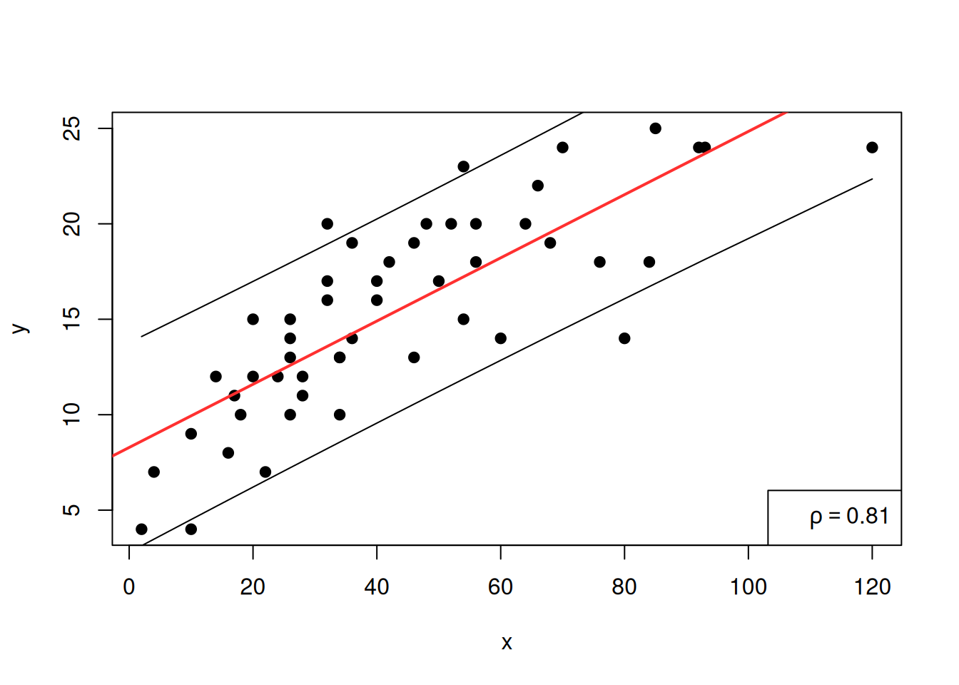
Exercise: What is the command order
used for ? What is the difference between order and
sort? Build your own example to make sure you understand
it.
Exercise: Modify the above code in order to obtain dashed lines for the predictions.
Exercise: Modify the above code in order to obtain dashed lines for the predictions with various confidence levels.
Non-linear regression
In fact, here, the graph suggests that there might be a better non-linear fit, for instance, with the square root of \(x\):
y<-cars$speed
x<-cars$dist
reg<-lm(y~I(sqrt(x)))
summary(reg)
##
## Call:
## lm(formula = y ~ I(sqrt(x)))
##
## Residuals:
## Min 1Q Median 3Q Max
## -7.3454 -1.7001 0.3198 2.0953 5.8880
##
## Coefficients:
## Estimate Std. Error t value Pr(>|t|)
## (Intercept) 1.6651 1.3326 1.25 0.218
## I(sqrt(x)) 2.2003 0.2033 10.82 1.77e-14 ***
## ---
## Signif. codes: 0 '***' 0.001 '**' 0.01 '*' 0.05 '.' 0.1 ' ' 1
##
## Residual standard error: 2.88 on 48 degrees of freedom
## Multiple R-squared: 0.7094, Adjusted R-squared: 0.7034
## F-statistic: 117.2 on 1 and 48 DF, p-value: 1.773e-14Here, the I function is a keyword to change the class of
an object to indicate that it should be treated ‘as is’, here, replacing
\(x\) by \(\sqrt{x}\).
One can obtain the corresponding regression curve by using the computed regression coefficients:
reg$coefficients## (Intercept) I(sqrt(x))
## 1.665110 2.200327This gives the coefficient for the intercept and the other for \(\sqrt{x}\). This is a numerical vector, with names:
V=reg$coefficients
str(V)
## Named num [1:2] 1.67 2.2
## - attr(*, "names")= chr [1:2] "(Intercept)" "I(sqrt(x))"names(V)## [1] "(Intercept)" "I(sqrt(x))"Let us plot the regression curve, pay attention that we have to sort the values for \(x\) to obtain the right plot:
y<-cars$speed
x<-cars$dist
plot(x,y,pch=19)
reg<-lm(y~x)
xsort<-sort(x)
lines(xsort,V[1]+V[2]*sqrt(xsort),col="firebrick1",lwd=2)
legend("bottomright",legend=bquote(rho == .(round(cor(sqrt(x), y), 2))))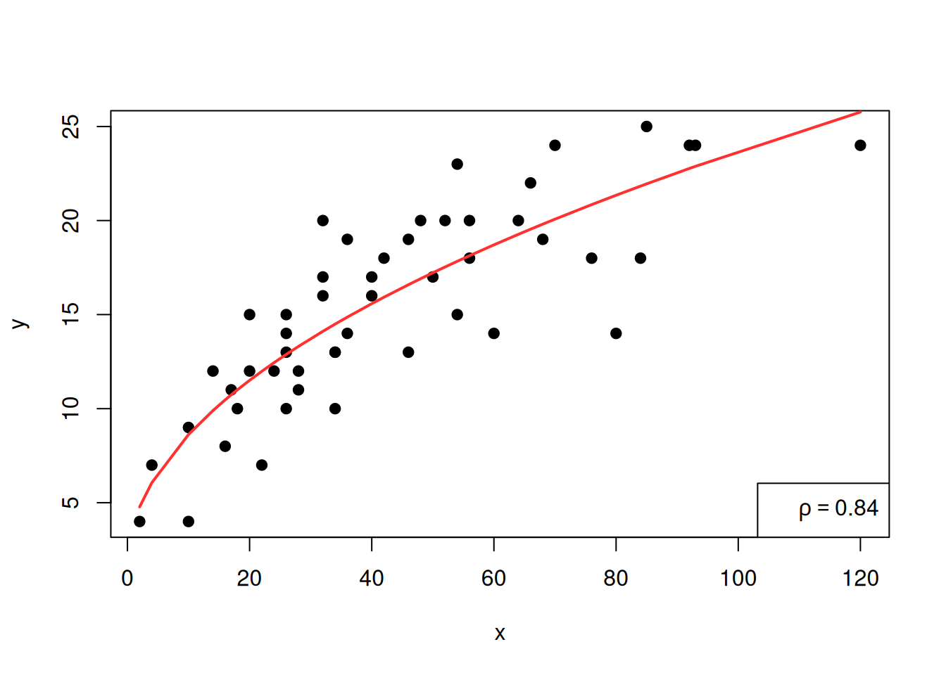
We see that the \(\rho\) coefficient has increased, suggesting that this model is a better one.
Go to the next tab !
Two categorical variables
Loading an external dataset
We will work with a dataset that can be downloaded here. This is a data table provided by an INSA professor.
Right-click and save as a textfile in an appropriate directory. Then,
go back to RStudio, and go to Session>Set Working
Directory>Choose Directory and place yourself in the directory where
the file wine.txt is saved. Then, load this dataset in R
the following way:
my_data<-read.table(file="wine.txt",header = T)
#View(my_data)
str(my_data)
## 'data.frame': 600 obs. of 8 variables:
## $ Qualite : chr "medium" "medium" "medium" "medium" ...
## $ Type : int 1 0 0 0 0 1 0 0 0 0 ...
## $ AcidVol : num 0.62 0.34 0.22 0.35 0.42 0.48 0.21 0.28 0.3 0.4 ...
## $ AcidCitr: num 0.01 0.1 0.22 0.46 0.32 0.32 0.32 0.14 0.25 0.42 ...
## $ SO2lbr : num 8 17 39 61 20 21 39 64 21 41 ...
## $ SO2tot : int 46 63 110 183 167 122 113 159 124 176 ...
## $ Densite : num 0.993 0.994 0.999 0.998 0.995 ...
## $ Alcool : num 11.8 9.2 9 9 10.6 9.4 10.2 10 10.8 9.4 ...This dataset includes physicochemical measurements performed on a sample of 600 Portuguese wines (red and white). These measurements are complemented by a sensory evaluation of quality conducted by a panel of experts. Each wine is described by the following variables:
- Quality: its sensory evaluation by experts (“bad,” “medium,” “good”),
- Type: its type (1 for red wine, 0 for white wine),
- AcidVol: the volatile acidity content (in g/dm³ of acetic acid),
- AcidCitr: the citric acid content (in g/dm³),
- SO2lbr: the free sulfur dioxide content (in mg/dm³),
- SO2tot: the total sulfur dioxide content (in mg/dm³),
- Density: the density (in g/cm³),
- Alcohol: the alcohol content (in % Vol.).
Exercise: Save the file wine.txt as a
csv file (open it with a spreadsheet editor and export as a csv
file). Now, load the dataset in R using the
write.csv2 command (pay attention to the arguments of this
command).
Exercise: Another way to import the dataset: click
the import button in the environment panel and follow the
instruction.
Exercise: Give the right type to each variable (with
as.factor, as.numeric, and so on).
Tables
At first, let us change the type of the two variables Quality and Type:
my_data$Qualite = as.factor(my_data$Qualite)
my_data$Type = factor(my_data$Type, labels = c("white", "red"))
head(my_data)
## Qualite Type AcidVol AcidCitr SO2lbr SO2tot Densite Alcool
## 1352 medium red 0.62 0.01 8 46 0.99332 11.8
## 5493 medium white 0.34 0.10 17 63 0.99370 9.2
## 5153 medium white 0.22 0.22 39 110 0.99855 9.0
## 5308 medium white 0.35 0.46 61 183 0.99786 9.0
## 3866 medium white 0.42 0.32 20 167 0.99479 10.6
## 694 medium red 0.48 0.32 21 122 0.99840 9.4Here, in changing the type of Type we also change the labels of the levels.
In statistics, a contingency table (also known as a cross tabulation
or crosstab) is a type of table in a matrix format that displays the
multivariate frequency distribution of the variables. To obtain the
contingency table, use the table function:
table(my_data$Qualite,my_data$Type)##
## white red
## bad 17 2
## good 89 21
## medium 319 152It means that there is \(17\) wines that are both red and bad for instance. There is a visual way to represent the contengency table which is the mosaic plot:
mosaicplot(table(my_data$Qualite, my_data$Type))
Another, maybe more classical, plot for two categorial variables consists of having the barplots of the two variables side by side:
barplot(prop.table(table(my_data$Type,my_data$Qualite)),beside=T,col=c("red","white"))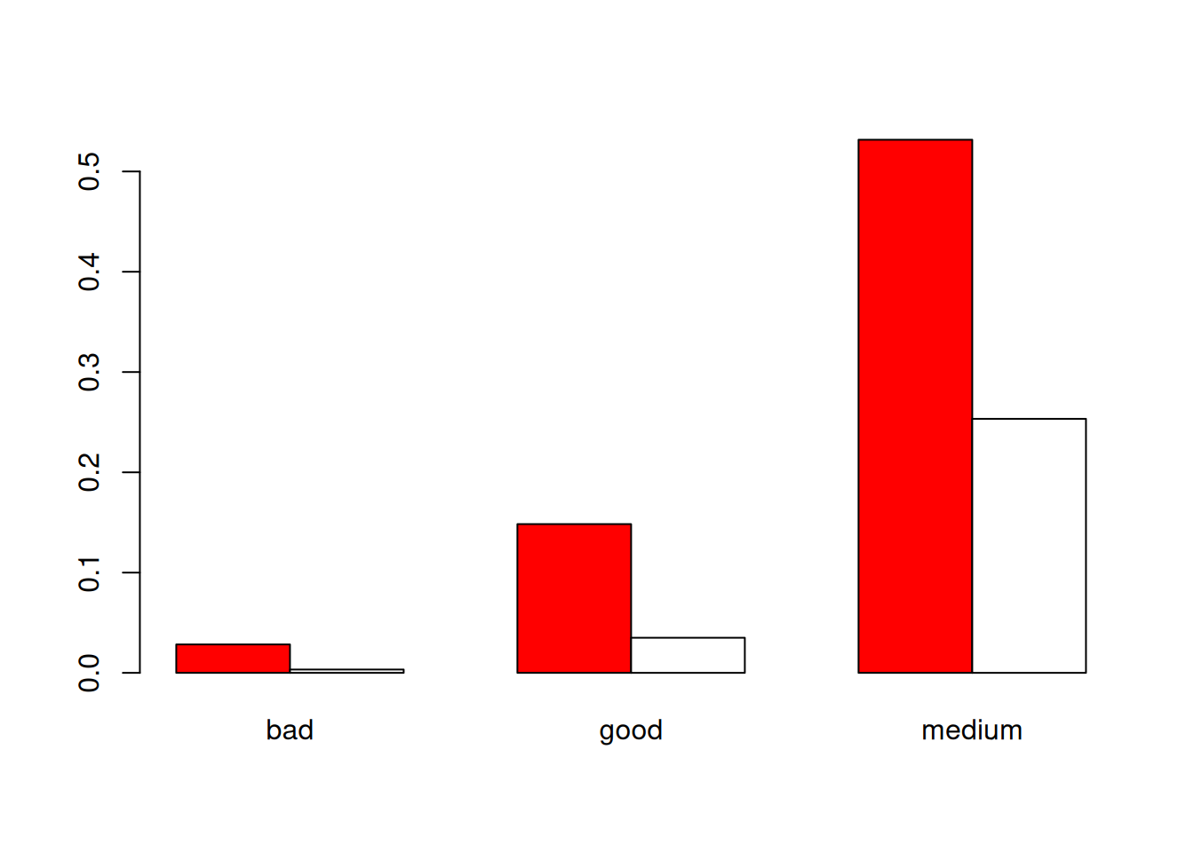
Exercise: Do the barplot the other way around, change the colors, add a main title…
We can obtain the contengency table of the proportions:
prop.table(table(my_data$Qualite,my_data$Type))##
## white red
## bad 0.028333333 0.003333333
## good 0.148333333 0.035000000
## medium 0.531666667 0.253333333We can add the sum over the line and column too thanks to the
addmargins (add the marginals) function:
tab<-prop.table(table(my_data$Qualite,my_data$Type))
addmargins(tab,c(1,2))
##
## white red Sum
## bad 0.028333333 0.003333333 0.031666667
## good 0.148333333 0.035000000 0.183333333
## medium 0.531666667 0.253333333 0.785000000
## Sum 0.708333333 0.291666667 1.000000000A first way of investigating the independence between the two variables Type and Quality is to construct the conditional frequency table. That is, for the first line, we want to have:
c(0.028333333,0.003333333)/0.031666667## [1] 0.8947368 0.1052631In probability, this would correspond to (where the \(|\) is for “knowing that”): \[ \mathbf{P}({\rm Type}={\rm white}|{\rm Quality}={\rm bad})\quad{\rm and}\quad \mathbf{P}({\rm Type}={\rm red}|{\rm Quality}={\rm bad}) \] If \[ \mathbf{P}({\rm Type}={\rm white}|{\rm Quality}={\rm bad})=\mathbf{P}({\rm Type}={\rm white})\quad{\rm and}\quad \mathbf{P}({\rm Type}={\rm red}|{\rm Quality}={\rm bad})=\mathbf{P}({\rm Type}={\rm red}) \] this means that the variable Type is independent from the event ‘Quality=bad’. Here we have the frequencies, for white and red:
c(sum(tab[,1]),sum(tab[,2]))## [1] 0.7083333 0.2916667and for the confitional frequencies
c(0.028333333,0.003333333)/0.031666667## [1] 0.8947368 0.1052631To obtain all the conditional frequencies, we can use the
margin argument of the prop.table
function:
prop.table(table(my_data$Qualite,my_data$Type),margin = 1)##
## white red
## bad 0.8947368 0.1052632
## good 0.8090909 0.1909091
## medium 0.6772824 0.3227176We can also look at the law of the Quality conditional to the Type,
we use the other margin:
prop.table(table(my_data$Qualite,my_data$Type),margin=2)##
## white red
## bad 0.04000000 0.01142857
## good 0.20941176 0.12000000
## medium 0.75058824 0.86857143To be compared to
c(sum(tab[1,]),sum(tab[2,]),sum(tab[3,]))## [1] 0.03166667 0.18333333 0.78500000I would bet on the fact that there is a dependency, but can we objectify it a bit more? We can perform a Fisher’s exact test:
fisher.test(my_data$Qualite,my_data$Type)##
## Fisher's Exact Test for Count Data
##
## data: my_data$Qualite and my_data$Type
## p-value = 0.003755
## alternative hypothesis: two.sidedThe p-value is quite small: the test rejects independence between Type and Quality.
Exercise: If you would like to find out more about the Fisher exact test…
Go to the next tab !
Factorial versus quantitative
We will still use the data wine to explore the possible
link between the factorial variable Type and the quantitative
variable AcidVol.
Some plots
There is a choice of possible graphics. At first, we can do the histograms in function of the Type.Let us select the two subsets for AcidVol:
RedAcidVol<-my_data$AcidVol[my_data$Type=="red"]
WhiteAcidVol<-my_data$AcidVol[my_data$Type=="white"]
and then plot the two histograms on the same plot, with transparency:
hist(RedAcidVol,col=rgb(1,0,0,0.5),xlim=c(0.1,1.2),ylim=c(0,5),freq=F)
hist(WhiteAcidVol,col=rgb(0,0,0,0.5),add=T,freq=F)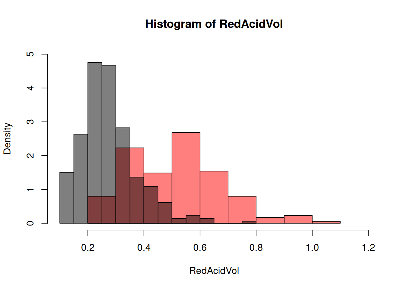
Exercise: Add an appropriate legend, change the colors, transparency…
Exercise: We can select a subset of a data table
according to some characteristic using the subset function.
Try to do it.
We see that the variable AcidVol seems to be correlated with the variable Type. Anoter popular representation is thanks to the boxplots:
boxplot(my_data$AcidVol~my_data$Type,col=c("white","red"))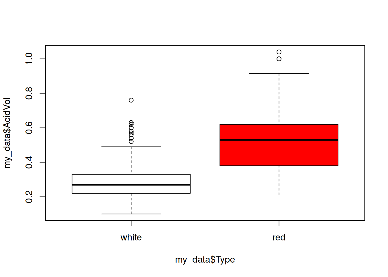
Note the syntax: we used the ~ in order to say “in
function of”.
Exercise: Reproduce these kinds of graphs with
another quantitative variable and another qualitative variable from the
wine dataset.
Correlation ratio
The correlation ratio is a statistical indicator that measures the strength of the relationship between a quantitative and a qualitative variable. In our example, we can consider the following quantities. The means of AcidVol, AcidVol if red and AcidVol if white:
meanA<-mean(my_data$AcidVol)
meanAR<-mean(RedAcidVol)
meanAW<-mean(WhiteAcidVol)
If we denote by \((y_i)_{1\leq i\leq
n}\) and \((x_i)_{1\leq i\leq
n}\) the AcidVol and Type vectors, we
have just computed: \[
\bar{y}_n,\quad \bar{y}_{n,R}=\frac{1}{n_R}\sum_{i,~x_i\in{\rm red}}
y_i,\quad \bar{y}_{n,W}=\frac{1}{n_W}\sum_{i,~x_i\in{\rm white}} y_i
\] where \(n_R\) and \(n_W\) are the numbers of red and white
wines, respectively.
We can also consider the sum of the centred squares (related to the variance):
TotalSquaresA<-sum((my_data$AcidVol-meanA)^2)that is \[ SC_{\rm totale}=\sum_{i=1}^n (y_i-\bar{y}_n)^2 \] and what is called the inter-class variability, related to the variance of the conditional means,
InterSquaresA<-length(RedAcidVol)*(meanAR-meanA)^2+length(WhiteAcidVol)*(meanAW-meanA)^2that is \[ SC_{\rm inter}=n_R(\bar{y}_{n,R}-\bar{y}_{n})^2+n_W(\bar{y}_{n,W}-\bar{y}_{n})^2 \]
The correlation ratio is then the ratio of these two quantities:
InterSquaresA/TotalSquaresA## [1] 0.4481639that is \[ \frac{SC_{\rm inter}}{SC_{\rm totale}}. \]
This is the percentage of variability (of variable AcidVol here) due to differences between classes (of variable Type here). This indicator varies between 0 (the classes have exactly the same mean: the variables are not related) and 1 (the individuals in the same class have exactly the same value: the variables are perfectly linked, since when we know one we know the other). Here, there is some dependency between the two variables.
Exercise: Do the same thing with the variable Quality and the variable AcidCitr.
Analysis of variance (Anova)
There is another way to obtain this information (about the dependence between a factorial variable and a quantitative variable), it is to perform an analysis of variance (Anova):
anova<-aov(my_data$AcidVol~my_data$Type)
summary(anova)
## Df Sum Sq Mean Sq F value Pr(>F)
## my_data$Type 1 7.221 7.221 485.7 <2e-16 ***
## Residuals 598 8.891 0.015
## ---
## Signif. codes: 0 '***' 0.001 '**' 0.01 '*' 0.05 '.' 0.1 ' ' 1In the resulting table, the column Sum Sq corresponds to
the the inter-class variability and the intra-class variability
InterSquaresA## [1] 7.220727TotalSquaresA-InterSquaresA## [1] 8.891073To these two sum of squares are associated in the column
Df two degrees of freedom corresponding to
- the number of levels minus one, here \(2-1\) ;
- the number of data minus the number of levels, here \(600-2\).
This allows to compute the mean of squares (in the column
Mean Sq): the sum of squares divided by the degree of
freedom. The F value corresponds to the ratio of these two
means. If there is independence between the two variables,
F should be distributed as a Fisher law with parameters
\(2-1\) and \(600-2\) here.
The underlying statistical model is here \[ y_{i,j}=\alpha_{j}+\epsilon_{i,j} \] with \(j\in\{{\rm red},{\rm white}\}\), where the \((y_{i_j})\) corresponds to the marked (typed) \((y_i)\) and the \(\epsilon_{i,j}\) are centred and independent gaussian variables. The Fisher test aims to know if there is an effect of the factorial variable, that is if \(\alpha_j\) depends on \(j\).
Exercise: Plot the density of the Fisher law with
the considered parameters and check that the p-value corresponds to the
one given by the R output.
The p-value is quite small here <2e-16 indicating
that the link between de variables AcidVol and
Type is statistically significant.
Go to the next tab !
Simulate two-dimensional random variables
Basics
Let us simulate two independent random variables \(X\) and \(Y\) according to a uniform law on the interval \([0,1]\):
#size of the sample
n<-100
X<-runif(100)
Y<-runif(100)
The resulting vector \((X,Y)\) is in fact uniformly distributed in the square \([0,1]^2\). We can do the scatter plot:
plot(X,Y,pch=19)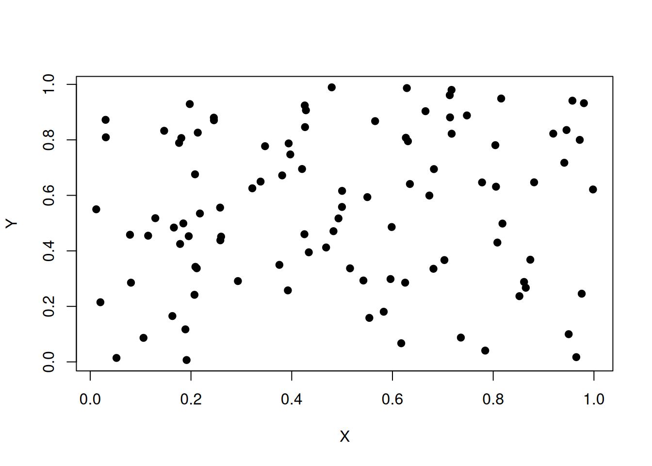
Exercise: Can we simulate data for a linear regression exercise ?
- Simulate \(20\) realizations of \(X\) distributed as a uniform law on \([0,10]\);
- Simulate the corresponding \(20\) realizations of \(Y=aX+b+Z\) where \(a=1.5\), \(b=-3\) and \(Z\) distributed as a centered normal law with standard deviation \(0.1\).
- Do the scatter plot of \((X,Y)\).
- Perform the linear regression trying to explain \(Y\) thanks to \(X\).
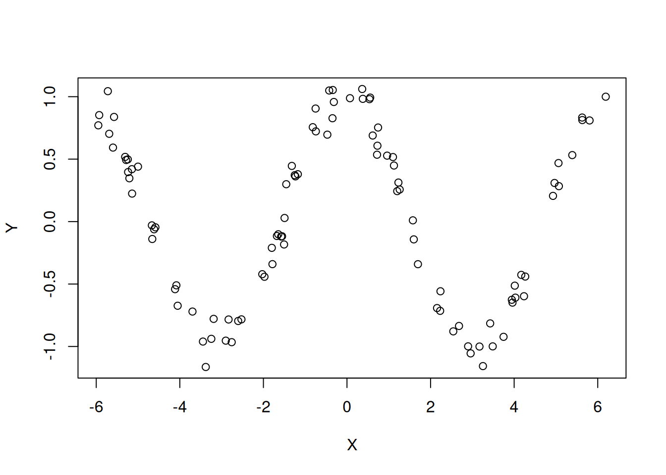
Exercise: Can you propose a function f
such that \(Y=f(X)+Z\) with \(Z\) some noise such that the resulting
correlation coefficient is near \(0\)
whereas there is an obvious visual dependency such as suggested by the
graph just below ?
Bivariate normal law
Due to the central limit theorem, the normal distribution plays an
important role in probability and statistics. In dimension \(2\), the normal law is characterized by its
expectations and covariance matrix, that is, if \((X,Y)\) follows a normal law, to properly
identify which one, we only need to know the vector of expectations (or
theoretical means): \[
\begin{pmatrix} \mathbf{E}(X)\\\mathbf{E}(Y)\end{pmatrix}
\] and the matrix of variance \[
V=\begin{pmatrix} {\rm Cov}(X,X) & {\rm Cov}(X,Y)\\ {\rm Cov}(Y,X)
& {\rm Cov}(Y,Y)\end{pmatrix}
=\begin{pmatrix} \mathbf{V}(X) & {\rm Cov}(X,Y)\\ {\rm Cov}(Y,X)
& \mathbf{V}(Y)\end{pmatrix}
\] In R, we can create with the command
matrix(what is the argument byrow for?):
E=c(1,2)
V=matrix(c(3,-3,-3,4),nrow=2,ncol=2,byrow=T)
V
## [,1] [,2]
## [1,] 3 -3
## [2,] -3 4The, to simulate a bivariate normal law, you can use the
mvrnorm from the MASS package:
library(MASS)
M=mvrnorm(100,mu = E,Sigma=V)
plot(M[,1],M[,2],pch=19)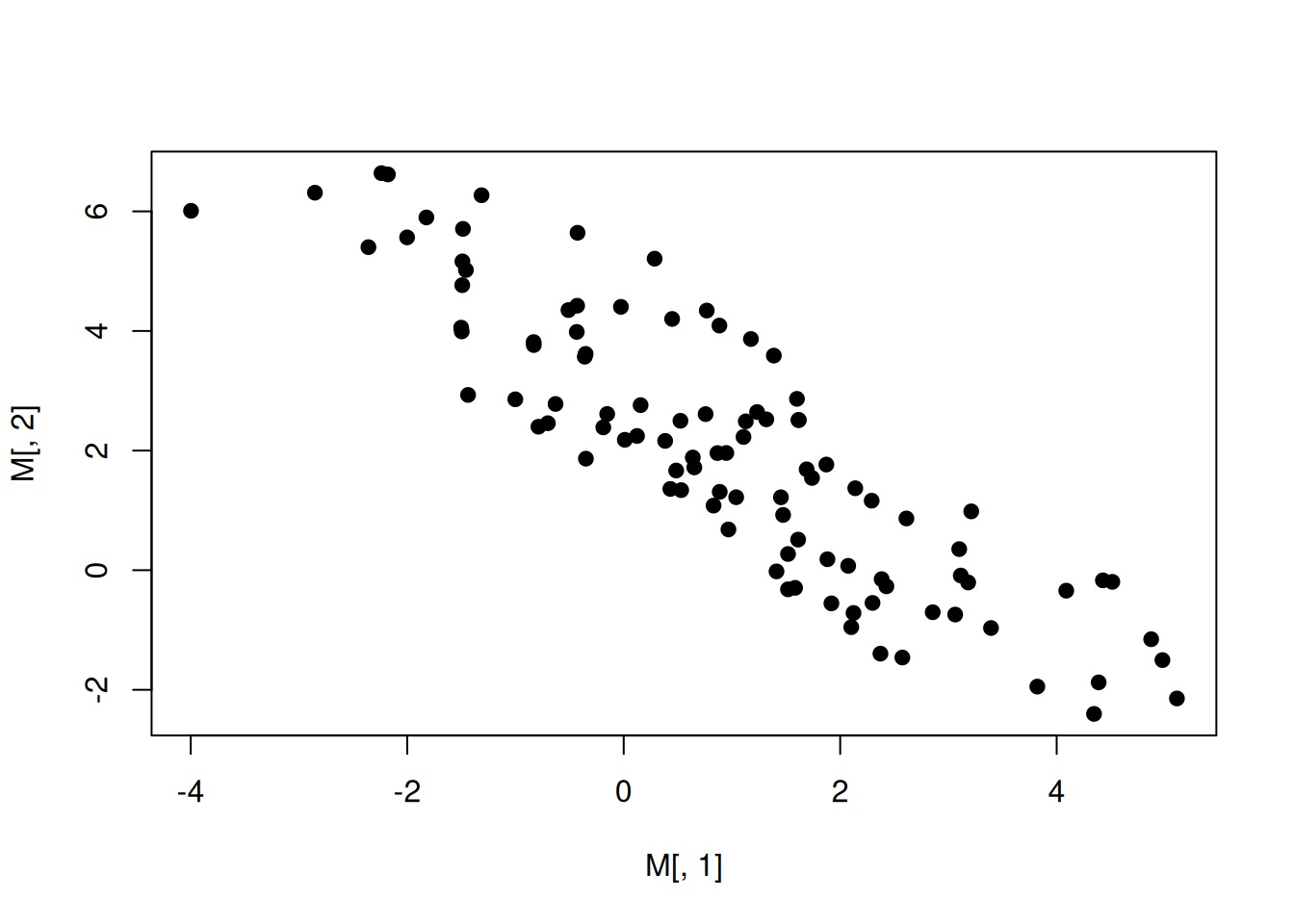
To a non singular covariance matrix, which always has some good
mathematical property, we can alsways associate an ellipse and here, an
ellipse of confidence. Let us draw this ellipse in order to have a
visual output for the covariance matrix, using a function in the
MASS and ellipse package:
library(MASS)
M=mvrnorm(100,mu = E,Sigma=V)
plot(M[,1],M[,2],pch=19)
robust_cov <- cov.trob(M)
library(ellipse,warn.conflicts = F)
ellip <- ellipse(V)
lines(E[1]+ellip[,1],E[2]+ellip[,2])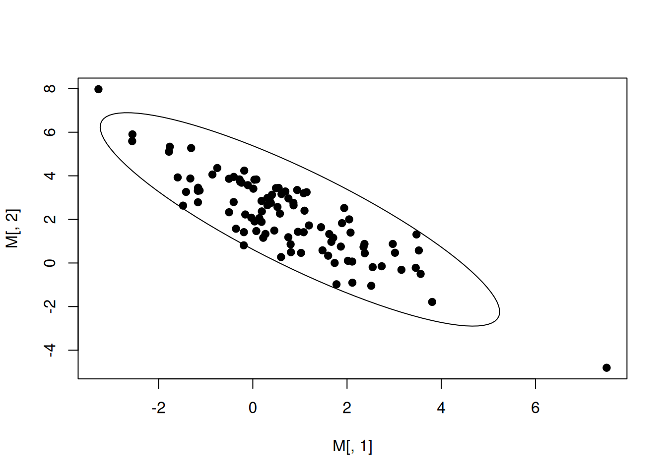
Here, the default for the level of confidence is \(0.95\).
Exercise: Change the covariance matrix and the vector of expectation to obtain various scatter plots and corresponding confidence ellipses.
Simulating quantitative versus qualitative data
Let us imagine that we want to simulate the size of \(150\) individuals from two distinct groups, A and B. We want \(65\%\) of individuals from the group A, and the others are in group B. You already learned how to do that:
group<-sample(c("A","B"),size=150,replace=TRUE, prob=c(0.65,0.35))Exercise: obtain the barplotof the
variable group, choose a different color for A and B and
write a main title.
We can then simulate size according to the two groups, thanks, for example, to two different normal distributions:
#create a vector full of NA
size<-rep(NA,length=150)
#The indices for the A individuals
indicesA<-which(group=="A")
#The indices for the B individuals
indicesB<-which(group=="B")
#The means and standard deviations for the two groups
muA<-10
sdA<-2
muB<-15
sdB<-3
#The sizes for the two groups
size[indicesA]<-rnorm(length(indicesA),mean=muA,sd = sdA)
size[indicesB]<-rnorm(length(indicesB),mean=muB,sd = sdB)
Exercise: Do an appopriate plot for this sample, compute the associated correlation ratio and perform an Anova.
Two factorial variables
Imagine that we want to simulate data that will end up in the following contengency table: \[ \begin{array}{|c|c|c|c|} \hline ~& A&B&C\\ \hline D&10&15&23\\ \hline E&3&4&7\\ \hline F&22&6&29\\ \hline \end{array} \] Here is one naïve way. We first simulate a sample of A, B and C according to the sum of the rows:
n<-10+3+22+15+4+6+23+7+29
nA<-10+3+22
nB<-15+4+6
nC<-23+7+29
ABCgroup<-sample(c("A","B","C"),size = n,prob=c(nA,nB,nC)/n,replace=T)
Then, for each level, we sample according to the inner proportion of D, E and F:
DEFgroup<-rep(NA,length=n)
indicesA=which(ABCgroup=="A")
DEFgroup[indicesA]<-sample(c("D","E","F"),size = length(indicesA),prob=c(10,3,22),replace=T)
indicesB=which(ABCgroup=="B")
DEFgroup[indicesB]<-sample(c("D","E","F"),size = length(indicesB),prob=c(15,4,6),replace=T)
indicesC=which(ABCgroup=="C")
DEFgroup[indicesC]<-sample(c("D","E","F"),size = length(indicesC),prob=c(23,7,29),replace=T)
table(DEFgroup,ABCgroup)
## ABCgroup
## DEFgroup A B C
## D 14 15 24
## E 2 4 4
## F 22 4 30But we can also do it in an exact way. At first, we can Ccreate a data frame from all combinations of the supplied factors (all combinations of A, B, C and D, E, F here).
#
my_data <- expand.grid(DEF = c("D","E","F"),ABC = c("A","B","C"))
my_data
## DEF ABC
## 1 D A
## 2 E A
## 3 F A
## 4 D B
## 5 E B
## 6 F B
## 7 D C
## 8 E C
## 9 F CThen, we will replicate each line of my_data according
to its frequency in the contengency table:
#the frenquences
counts <- c(10,3,22,15,4,6,23,7,29)
# Repeat each row based on the frequency
my_data <- my_data[rep(1:nrow(my_data), times = counts), ]
head(my_data)
## DEF ABC
## 1 D A
## 1.1 D A
## 1.2 D A
## 1.3 D A
## 1.4 D A
## 1.5 D AWe then shuffle the indices to obtain a randomized sample:
my_data <- my_data[sample(nrow(my_data)), ]
head(my_data)
## DEF ABC
## 4 D B
## 7.15 D C
## 1.9 D A
## 4.13 D B
## 9.19 F C
## 4.1 D BWe can check that the obtained contengency table is the good one:
table(my_data)## ABC
## DEF A B C
## D 10 15 23
## E 3 4 7
## F 22 6 29Exercise: Do the statistical analysis of this contengency table (as in a previous tab).