Doctoral school course: an introduction to R
Block 3: Around a specific dataset
The dataset
You can download the dataset from the github page or from here (xx) and here (yy).
You will download two .dat files: a .dat
file is a generic data file that stores information in a raw or binary
format. Here, the file telomers_xx.dat contains the \(x\)-position of let say some DNA region,
for a hundred of experiments, recorded from time \(0\) to \(2000\Delta t\) according to some (unknown)
time step \(\Delta t\). The file
telomers_yy.dat contains the corresponding values for the
\(y\)-axis. One way to import such
format is to use the read.table function. Recall that you
can have some help to understand the arguments and outputs of a function
using
?read.tableHere, the field separator character is the tab key ’ and there is no name for the variables in the first line:
X<-read.table("telomers_xx.dat",sep="\t",header=F)
Y<-read.table("telomers_yy.dat",sep="\t",header=F)
X[1,1:5]
## V1 V2 V3 V4 V5
## 1 -9.478 -9.477 -9.502 -9.472 -9.495Well, let us check the format of X and
Y:
class(X)## [1] "data.frame"Remar that in the data.frame format, the columns are
named. Since this is in fact an array of numerical values, it could be
better to consider it as an uname numerical matrix:
X<-as.matrix(X)
X<-unname(X)
Let us look at the first \(3\) lines and first \(5\) columns to be sure that all goes as we wanted to:
X[1:3,1:5]## [,1] [,2] [,3] [,4] [,5]
## [1,] -9.478 -9.477 -9.502 -9.472 -9.495
## [2,] -6.103 -6.113 -6.149 -6.113 -6.111
## [3,] -4.863 -4.870 -4.916 -4.904 -4.869Exercise: Import these datasets with other functions
(with read.delim, or read.csv2, from the
import function).
Each line of the data frame \(X\) corresponds to the \(x\)-values of a trajectory. There is
nrow(X)## [1] 100trajectories, sampled according to some constant time step. The size of each trajectory is:
ncol(X)## [1] 2000We can plot the x-axis of one of the trajectories as a function of time, for example, the first one
plot(1:ncol(X),X[1,],type="l", col="blue",xlab="time", ylab="x-value")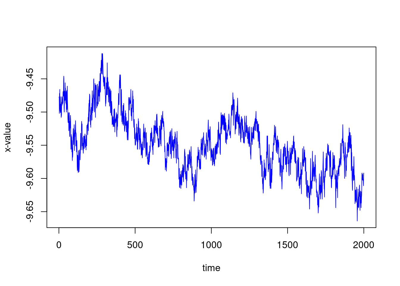
We could also plot the first three ones, on the same plot:
plot(1:ncol(X),X[1,],type="l", col="blue",xlab="time", ylab="x-value",ylim=c(-10,-4))
lines(1:ncol(X),X[2,])
lines(1:ncol(X),X[3,],col="red")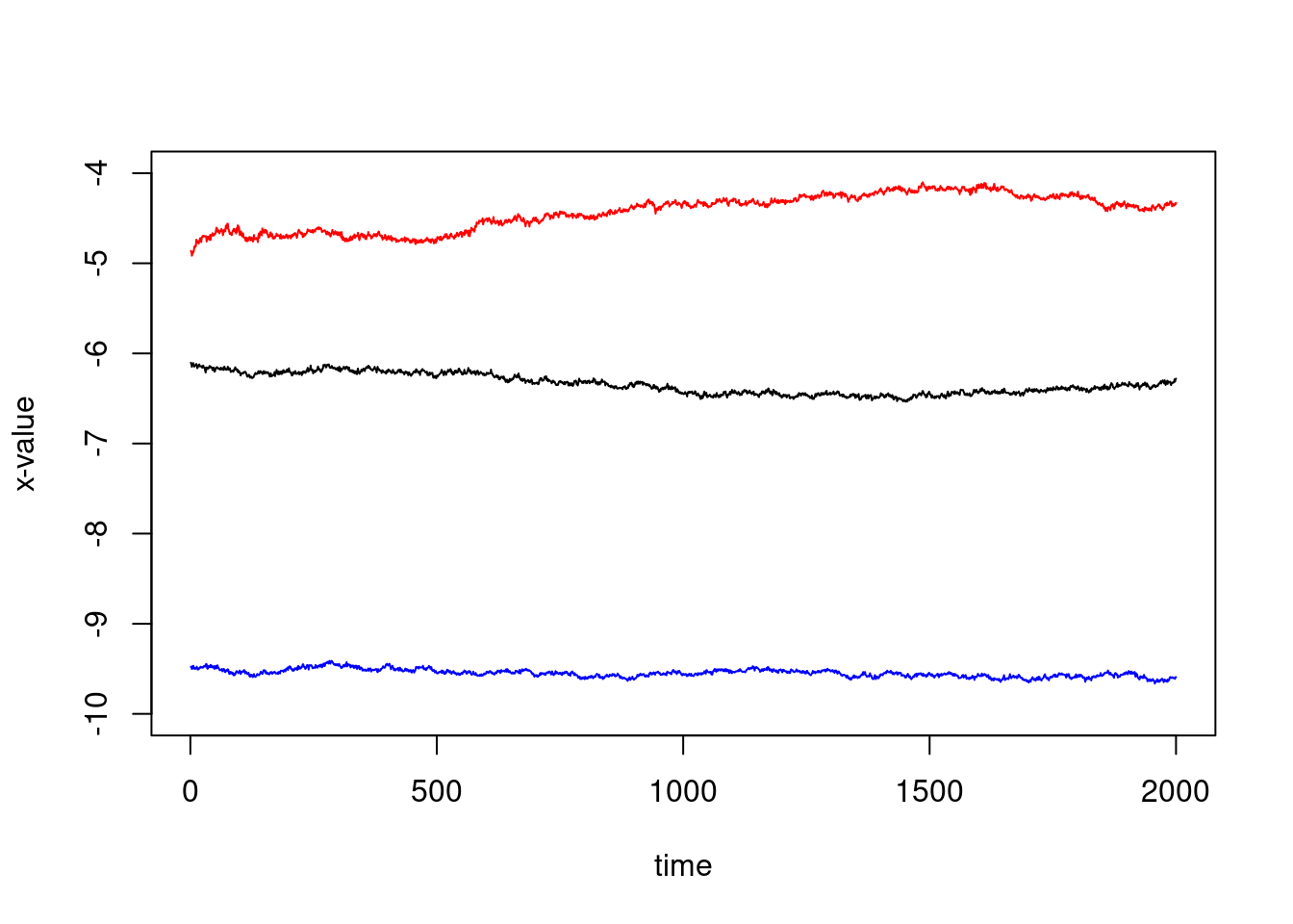
But since there is some kind of translation, this is not very telling… We might substract the first value to have zero as first point:
plot(1:ncol(X),X[1,]-X[1,1],type="l", col="blue",xlab="time", ylab="x-value",ylim=c(-1,1))
lines(1:ncol(X),X[2,]-X[2,1])
lines(1:ncol(X),X[3,]-X[3,1],col="red")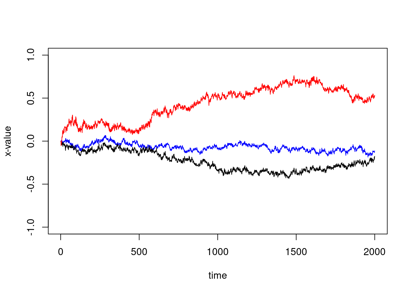
Using a for loop and colors chosen at random, you can
plot all the trajectories on the same window:
plot(X[1,]-X[1,1],type="l",ylim=c(-2,2),xlab="time",ylab="x")
for(i in 2:100){
  my_col<-rgb(runif(1),runif(1),runif(1))
  lines(X[i,]-X[i,1],col=my_col)
}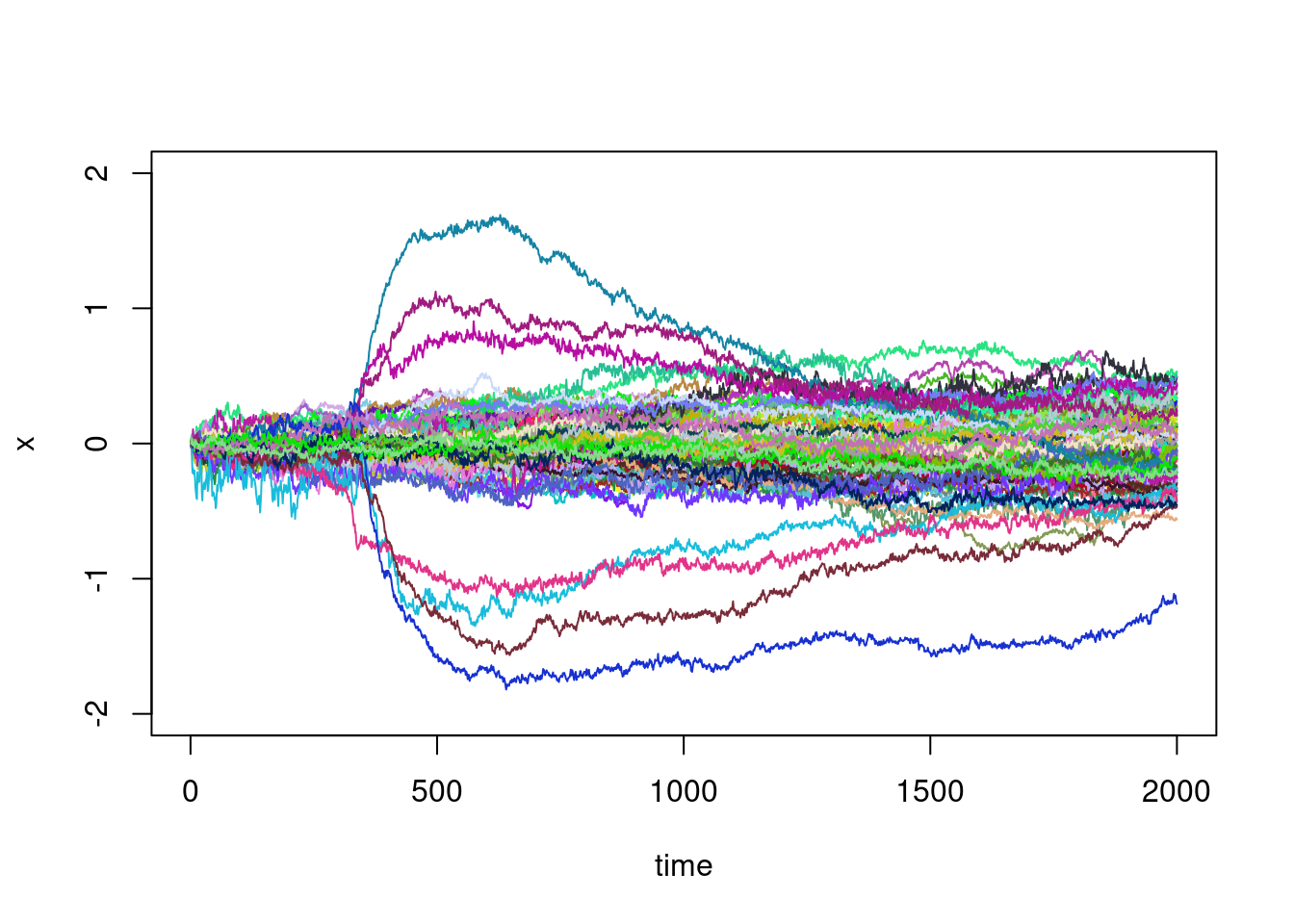
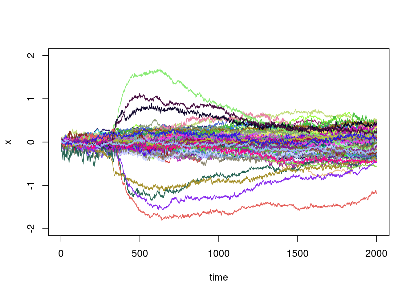
This graph is telling and there is some natural questions:
- There are a few trajectories that make large excursions in relation to the others: can they be identified automatically?
- These large excursion seem to begin at roughly the same time: can we identify this time?
- For the other trajectories, they seem to be those of a random walk, or of a diffusion process in which the variance increases steadily with time: can we verify this?
Apply and piecewise linear regression…
This section is an excuse to learn a little about the syntax of the
apply function.
As metioned by the help, the apply function
returns a vector or array or list of values obtained by applying a
function to margins of an array or matrix. For example, if we want the
mean of each trajectories, that is the mean of each row:
apply(X,MARGIN = 1,FUN = mean)## [1] -9.5479630 -6.3406060 -4.4319055 -4.1426225 -0.5154205 -0.2316900 0.4514835 2.5767530
## [9] 6.1017365 6.8157900 -9.2918365 -7.2673665 -4.2277245 -2.7522730 -0.1786840 1.6642855
## [17] 3.1197070 6.0925575 7.9188825 9.0018825 -6.0364445 -1.8313890 0.3749690 1.0922195
## [25] 2.7562435 3.3711210 5.9317855 -6.7208125 -3.1584020 -2.7192350 -1.0389245 0.9641320
## [33] 2.0311325 2.4589255 4.1673495 5.8042935 -8.3434035 -6.2465845 -5.2221045 -2.9376800
## [41] -2.2535330 0.2440600 1.8433155 3.3395110 9.2534105 -5.2156675 -4.7881270 -3.8175560
## [49] -3.0854250 -1.1725380 0.7715745 0.6645085 2.8291920 7.2918370 -7.6828015 -6.0510773
## [57] -4.8929025 -4.3209100 -0.7279335 0.8345055 1.0514465 2.4971265 4.9869015 7.3644685
## [65] 8.0727705 -9.4136425 -7.6191090 -5.9494435 -3.3926475 -0.2759305 2.0434580 5.2831960
## [73] 6.2023890 8.9133935 -12.6531065 -8.7219910 -7.0363355 -5.7814210 -3.7447670 -1.7118130
## [81] -1.2439065 -0.5710380 0.3760115 2.5724045 4.6853145 8.1864760 9.3023850 -7.4590470
## [89] -4.6657005 -1.5672385 1.0980335 1.9899045 3.8587325 5.0404775 6.4582500 -10.4148260
## [97] -6.5732470 -4.0893410 -3.3776980 -2.1706655But this is the mean without having chosen \(0\) as common starting point. A shortcut to translate all the trajectories is to do
XX<-X-X[,1]Indeed, X[,1] is the column vector of the first values.
Is is not of the same dimension as the one of X, but it is
automatically replicated in order to substact the first colmun to each
column. You can verify that it works well by looking at the graph:
plot(XX[1,],type="l",ylim=c(-2,2),xlab="time",ylab="x")
for(i in 2:100){
  my_col<-rgb(runif(1),runif(1),runif(1))
  lines(XX[i,],col=my_col)
}
Let us go back to the mean:
XX_means<-apply(XX,MARGIN = 1,FUN = mean)Exercise: plot these means, do an histogram, a barplot…
We can do the same for the mean by column:
XX_means_2<-apply(XX,MARGIN = 2,FUN = mean)Exercise: plot the running mean as a function of time. What does the resulting graph suggests ?
Exercise: do the same thing with the running
max and min.
We can do the same thing with the variance by column and plot the resulting running variance.
XX_var_2<-apply(XX,MARGIN = 2,FUN = var)
plot(XX_var_2,xlab="time",ylab="x")
There is some inflexion point before time \(500\):
plot(XX_var_2[1:500],xlab="time",ylab="x")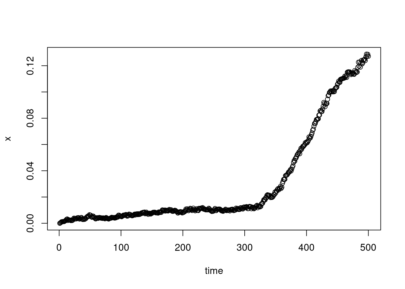
Let say at time
plot(XX_var_2[1:500],xlab="time",ylab="x")
abline(v=325)
In fact, we can find this “breacking time” using a piecewise linear
regression. The model is as follows. Denoting by \((a_i,b_i)_{1\leq i\leq n}\) the points of
the scatter plot, we want to find the “best” coefficients \(\alpha\), \(\beta\), \(\gamma\), \(\delta\) and \(T\) such that \[
b=(\alpha a+\beta){\bf 1}_{a<=T}+(\gamma a+\delta){\bf 1}_{a>T}.
\] The idea is to do a for loop on the coefficient
\(T\) in order to find the \(T\) such that the two underlying linear
regressions are (jointly) the best possible, using the Pearson
correlation coefficient:
val<-0
for(t in 10:490){
  cor1<-cor(XX_var_2[1:t],c(1:t))
  cor2<-cor(XX_var_2[(t+1):500],c((t+1):500))
  if((cor1^2+cor2^2)>val){
    val<-cor1^2+cor2^2
    my_t<-t
  }
}
my_t
## [1] 328This is quite close to our first proposition.
Exercise: Now that you have the “breaking time”,
find, thanks to the lm function, all the other coefficients
in the proposed piecewise linear regression and plot the two
corresponding segment on the scatter plot.
Does this point corresponds to the beginning of the large excursions ? It would make sens:
plot(XX[1,],type="l",ylim=c(-2,2),xlab="time",ylab="x")
for(i in 2:100){
  my_col<-rgb(runif(1),runif(1),runif(1))
  lines(XX[i,],col=my_col)
}
abline(v=my_t)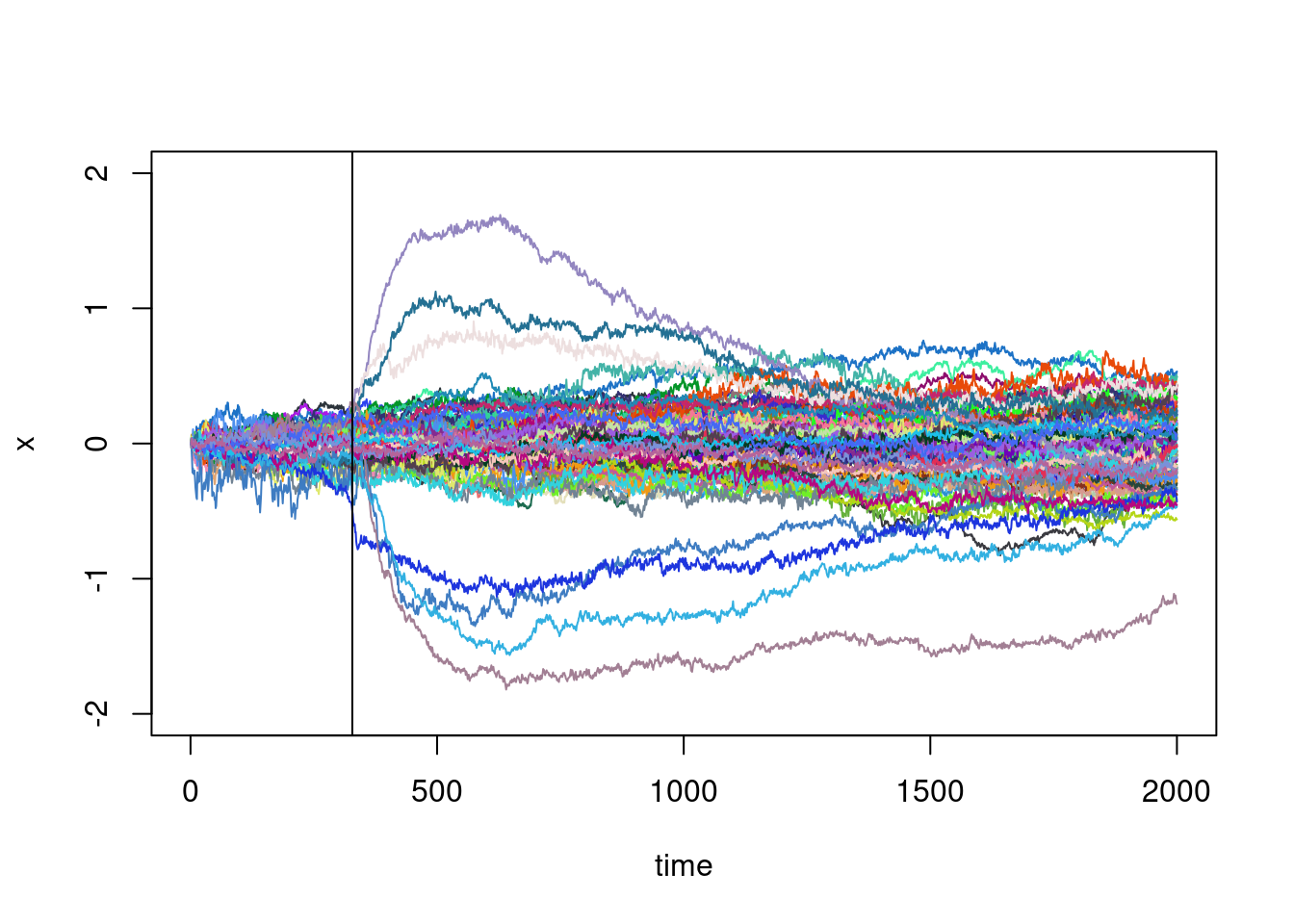
It also suggests that the running variance should be investigated without considering these large excursions. But how to identify it ?
Before doing that, let us say a few things more about
apply and learn to use sapply,
lapply or mapply (there is others
apply funcitons).
We can use apply with a personnal function, for example,
with the function:
my_function<-function(vec){
  return(sum(abs(vec-mean(vec))))
}
computing the centred L1 norm of a vector. We can then
apply this function to each row:
apply(X,MARGIN=1,FUN=my_function)## [1] 69.53489 195.13844 344.64178 162.38512 397.36366 220.05418 108.82862 89.19235 155.41877
## [10] 122.47080 129.91083 198.31627 163.02498 472.44503 201.45059 187.92818 197.94927 278.16227
## [19] 321.18993 364.03345 189.96389 119.88401 69.27264 171.84861 189.14465 164.80381 133.72702
## [28] 170.19338 345.52200 228.52448 202.39035 58.74205 53.08539 165.42934 93.65040 166.71820
## [37] 113.53500 100.48483 125.03228 231.15032 59.78618 139.38988 214.70288 114.81759 141.52733
## [46] 333.06975 150.94521 182.86694 151.50170 96.39090 158.26797 128.05486 96.54834 252.48793
## [55] 184.83516 132.34816 310.27652 149.75852 152.51635 188.13825 199.27223 166.39956 191.29775
## [64] 357.71602 165.06286 107.68229 133.48694 68.27274 97.84045 118.90125 97.80315 199.46194
## [73] 187.63883 359.51200 85.00785 190.59982 221.59849 96.72358 170.57926 146.04811 104.66054
## [82] 103.53545 91.80801 219.92475 157.68982 115.47506 99.68996 1036.73980 249.39370 398.08810
## [91] 594.63192 520.05470 494.74262 983.10392 716.03650 102.39890 303.49427 163.74374 140.52108
## [100] 139.40936The function sapply is similar to apply
except that it applies a function over a list or a vector. For example,
if we want to square each entry of a vector, you know that you can
do:
v<-X[1,]
head(v^2)
## [1] 89.83248 89.81353 90.28800 89.71878 90.15502 89.60516This can be achieve thanks to sapply the following way
(it is just for the example here, it is not a good way to square each
entry of a vector):
v2<-sapply(1:length(v),function(i) v[i]^2)
head(v2)
## [1] 89.83248 89.81353 90.28800 89.71878 90.15502 89.60516The function lapply treat the vector as a list:
v2<-lapply(1:length(v),function(i) v[i]^2)
head(v2)
## [[1]]
## [1] 89.83248
##
## [[2]]
## [1] 89.81353
##
## [[3]]
## [1] 90.288
##
## [[4]]
## [1] 89.71878
##
## [[5]]
## [1] 90.15502
##
## [[6]]
## [1] 89.60516It simply changes the format of the output, which is a
listhere.
Classification
Our aim is to identify the the trajectories with large excursions:
plot(XX[1,],type="l",ylim=c(-2,2),xlab="time",ylab="x")
for(i in 2:100){
  my_col<-rgb(runif(1),runif(1),runif(1))
  lines(XX[i,],col=my_col)
}
abline(v=my_t)
The main idea is to calculate a distance between curves, and to group together curves with similar distances, using a classification algorithm.
There is plenty of choice for the distance. For example, for two trajectories \((x^1_i)_{1\leq i\leq n}\) and \((x^2_i)_{1\leq i\leq n}\): \[ d_1(x^1,x^2)=\sum_{i=1}^n|x^1_i-x^2_i|,\quad d_2(x^1,x^2)=\sqrt{\sum_{i=1}^n|x^1_i-x^2_i|^2},\quad d_\infty(x^1,x^2)=\max_{1\leq i\leq n}|x^1_i-x^2_i|. \] Once you have chosen the distance, you can build the matrix of two-by-two distances. Here, this is a \(100\times 100\) matrix.
Exercise: Build this matric for the \(d_2\) distance using two (or one ?)
for loops.
Here is a faster way (computing \(d^2_2\) instead of \(d_2\)), based on the formula (this is just
\((a-b)^2=a^2+b^2-2ab\)): \[
d^2_2(x^1,x^2)=\sum_{i=1}^n(x^1_i)^2+\sum_{i=1}^n(x^2_i)^2 -
2\sum_{i=1}^n x^1_ix^2_i.
\] Using the outer function to perform an “outer
sum”:
dist_matrix <- outer(rowSums(XX^2), rowSums(XX^2), "+") - 2 * XX %*% t(XX)But, depending on your machine precision, it can produce negative
values (it should not). To correct that, you can add a pmax
(p for parrallel maxima, meaning here entrywise):
dist_matrix <- pmax(outer(rowSums(XX^2), rowSums(XX^2), "+") - 2 * XX %*% t(XX),0)Now that we have our distance matrix, we can apply a clustering
method to it. There are many ways of doing this, I will try to describe
one fairly common way called the hierarchical agglomerative clustering
(using, more precisely, the Ward's method).
- In the first step, we consider that there are as many classes as there are individuals (here, there are 100 individuals: the 100 trajectories).
- The aim is to reduce the number of classes which is done iteratively. At each stage, we merge two classes chosen as the “closest”, i.e. with minimum dissimilarity. This dissimilarity value, called the aggregation index, will increase from iteration to iteration, the first being the smallest.
- Ward’s distance aims to maximize what is called the inter-class inertia and is given here, for two classes \(C_1\) and \(C_2\) by: \[ d_W(C_1,C_2)=\frac{n_1n_2}{n_1+n_2}d^2_2(G_1,G_2) \] where \(n_1\) is the number of individuals in \(C_1\), \(n_2\) the number of individuals in \(C_2\), \(G_1\) and \(G_2\) their respective centers of gravity (simply the mean or a weighted average here).
- At each stage, the two classes with the smallest Ward’s distance are aggregated.
- We stop when there is just one class.
In R, we can do that in a quite efficient way using the
fastcluster library.
library(fastcluster)The first thing is to convert our distance matrix as a
dist object:
D<-as.dist(dist_matrix)Then, we can perform the clustering:
fc<-fastcluster::hclust(D,method="ward.D2")Note here that we have used the function hclust in
specifying that it is the function hclust from the library
fastcluster thanks to the command
fastcluster::hclust (instead of simply
hclust). We did this to remove any ambiguity, should we
have loaded other libraries containing a function named in the same way
(and for hclust, it is quite possible…).
We can then plot the associated dendrogram. A dendrogram is the graphic representation of a hierarchical ascending classification. It is often presented as a binary tree whose leaves are the individuals aligned on the x-axis. When two classes or two individuals meet at a certain Ward distance, vertical lines are drawn from the abscissa of the two classes to the ordinate of this distance, then connected by a horizontal segment.
plot(fc)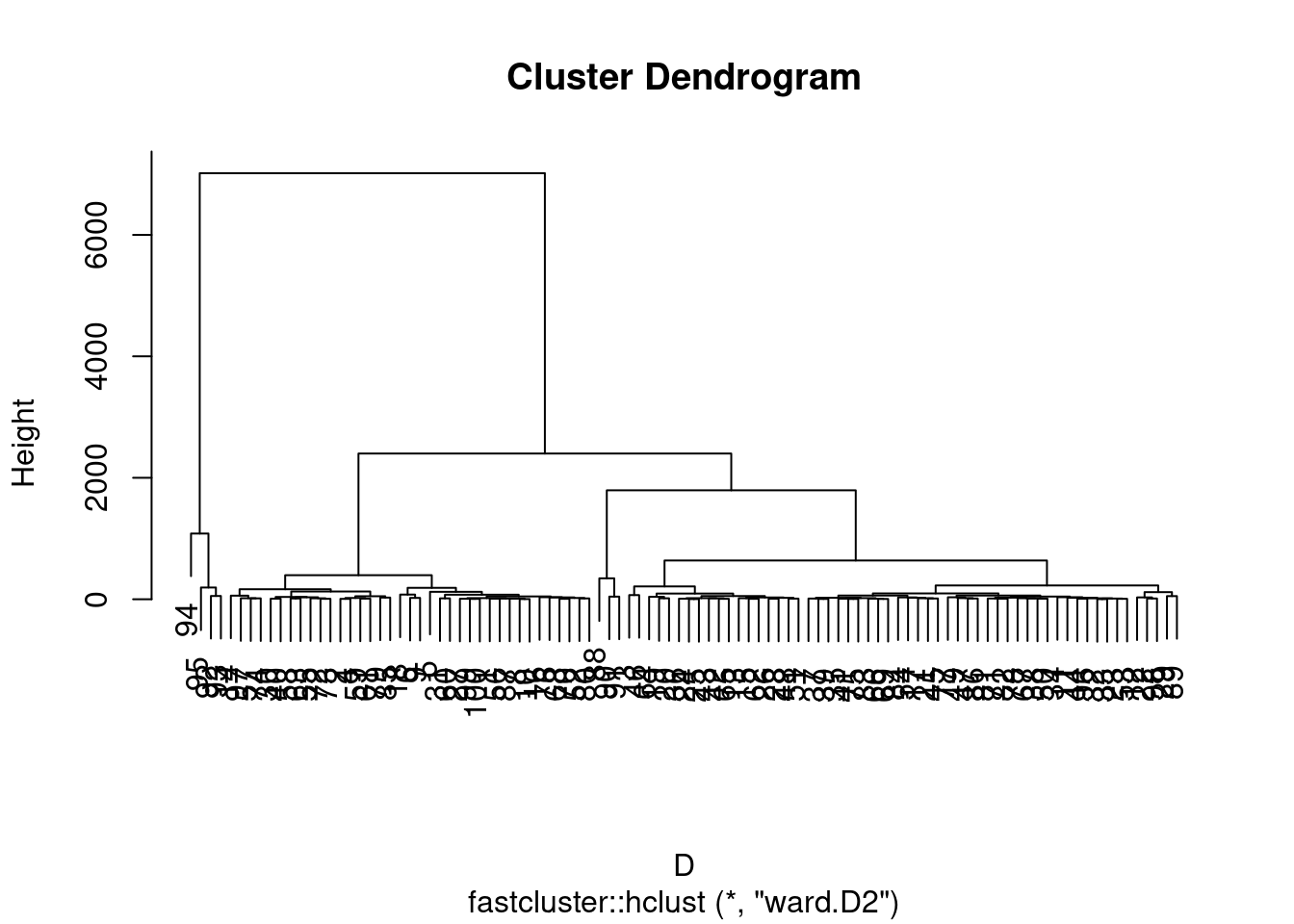 Libraries are available for more elegant dendrograms. But in fact, we
can certainly “pimp” this one. Before doing that, let us cut this tree
in order to retain \(4\) classes.
members <- cutree(fc, k = 4)
head(members)
## [1] 1 1 2 1 1 1In the members vector is indicated the class of each
individual. These 4 classes can be framed on the dendrogram.
plot(fc,labels=F,xlab="")
rect.hclust(fc, k=4, border=2:4)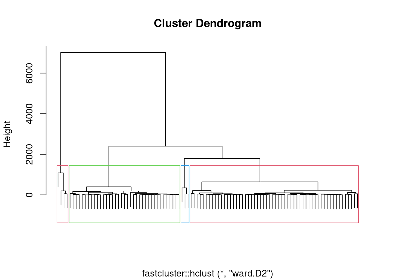 Now, it is time to plot our trajectories with colors representing the
classes (remark that the numbers of members are automatically recast as
colors).
plot(as.numeric(X[1,])-X[1,1],type="l",ylim=c(-2,2),col=members[1])
for(i in 2:100){
  lines(as.numeric(X[i,])-X[i,1],col=members[i])
}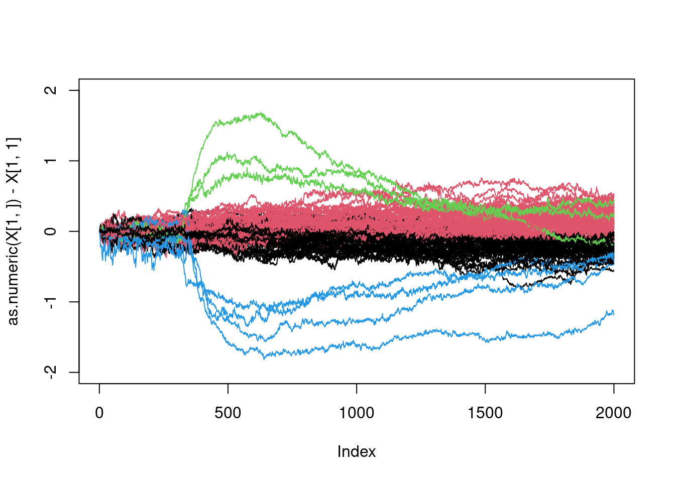
That is pretty good, isn’t it?
What is interesting here, is to be able to identify the curves in blue and green. It should corresponds to the two smalles clusters (in size):
table(members)## members
## 1 2 3 4
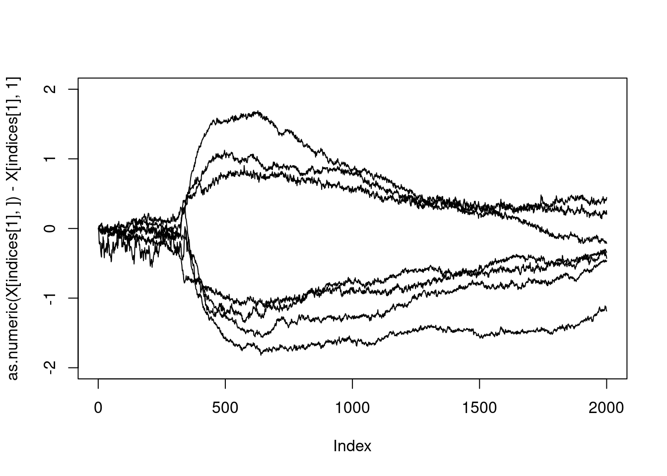
## 37 56 3 4So this is clustes \(3\) and \(4\) for a total of \(7\) curves:
which(members%in%c(3,4))## [1] 88 90 91 92 93 94 95The fact that the indices are consecutive is very strange: something must have happened… Let us check that this corresponds to the curve with large excursions:
indices<-which(members%in%c(3,4))
plot(as.numeric(X[indices[1],])-X[indices[1],1],type="l",ylim=c(-2,2),col=members[1])
for(i in 2:length(indices)){
  lines(as.numeric(X[indices[i],])-X[indices[i],1])
}
All right.
Exercise: Change the agglomeration method (see
?hclust for help). Do all methods succeed in detecting
trajectories with large excursions?
No, let us go back to the variance
XX_var_2_without<-apply(XX[-indices,],MARGIN = 2,FUN = var)
plot(XX_var_2_without,xlab="time",ylab="x")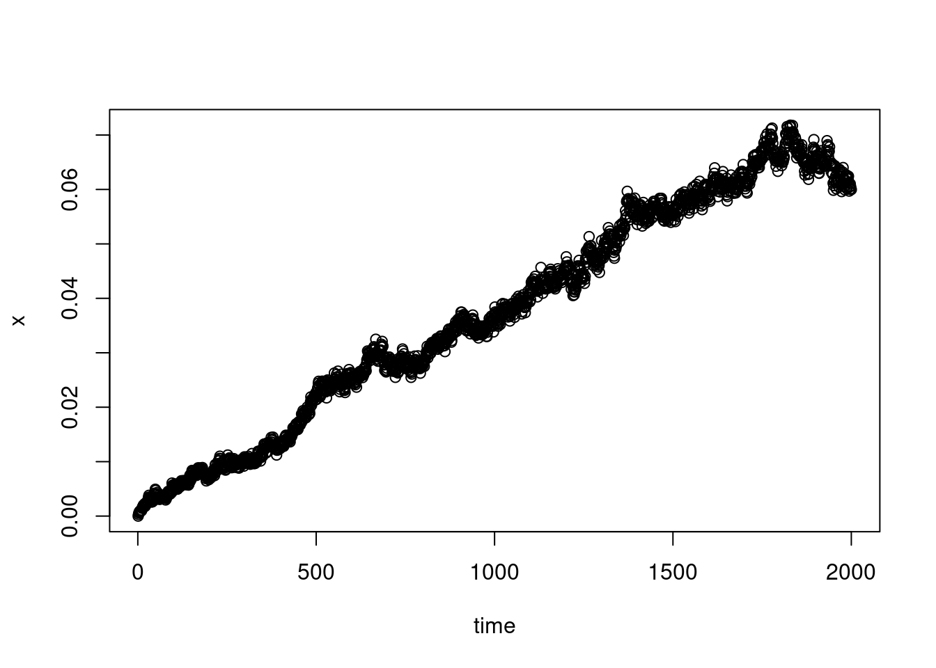
The growth is quite linear, as expected for a Brownian motion for example, although there does seem to be a certain waning at the end…
Exercise: Perform a linear regression to find the slope.
2d
X<-read.table("telomers_xx.dat",sep="\t",header=F)
Y<-read.table("telomers_yy.dat",sep="\t",header=F)
X<-as.matrix(X)
X<-unname(X)
Y<-as.matrix(Y)
Y<-unname(Y)
XX<-X-X[,1]
YY<-Y-Y[,1]plot(XX[1,],YY[1,],type="l",xlim=c(-2,2),ylim=c(-2,2),xlab="x",ylab="y")
for(i in 2:100){
my_col<-rgb(runif(1),runif(1),runif(1))
lines(XX[i,],YY[i,],col=my_col)
}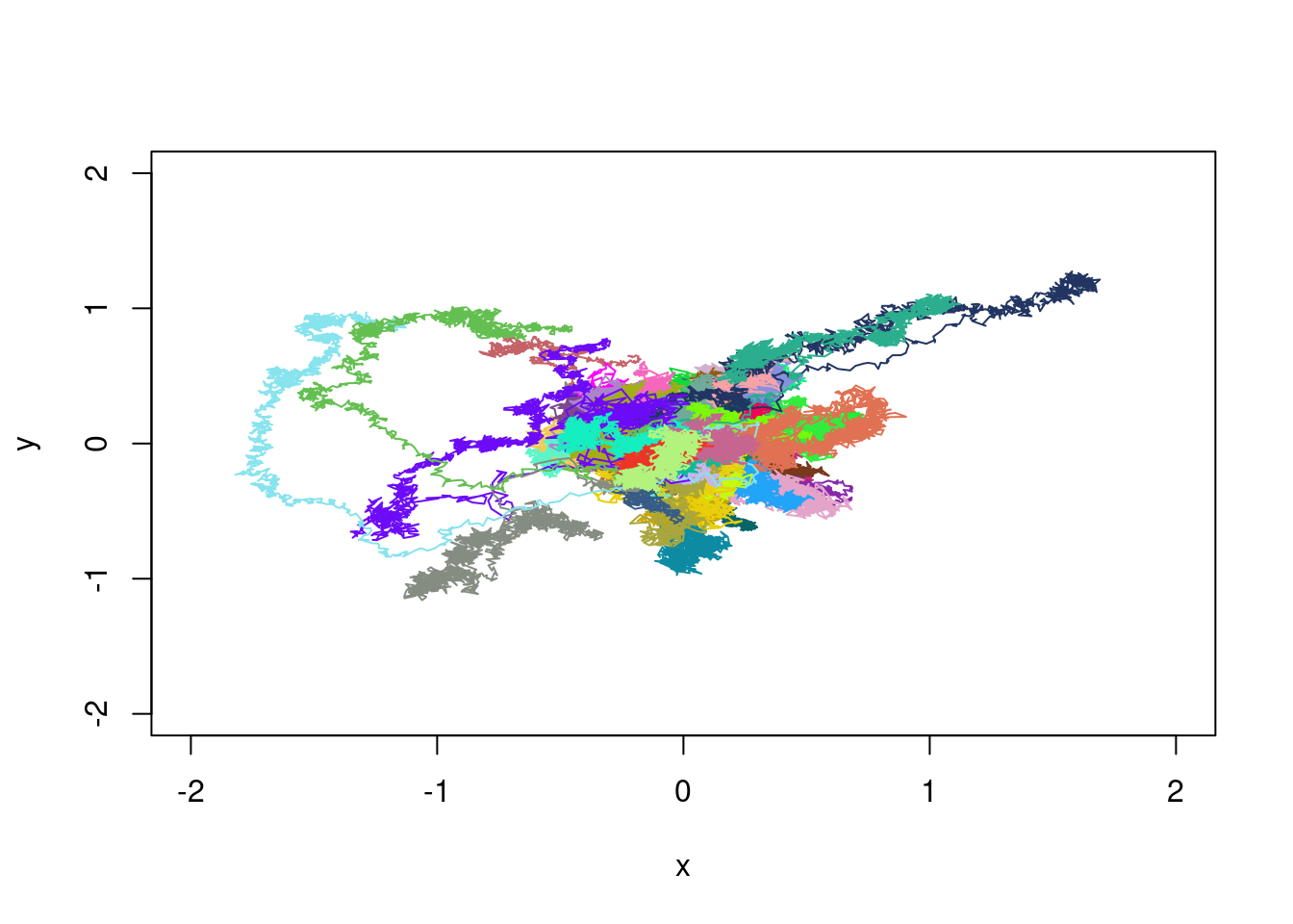
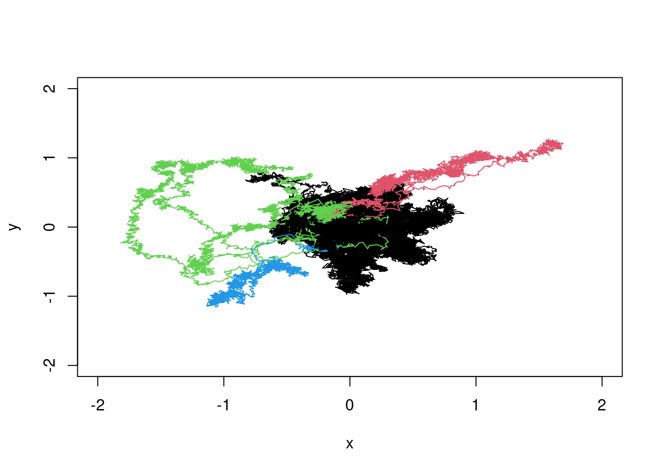
We see the trajectories with large excursions. We can as well as in dimension one, perform a clustering. The only change is in the distance, which must take both dimensions into account. For two trajectories \((x^{(1)},y^{(1)})\) and \((x^{(2)},y^{(2)})\), we can consider: \[ d^2_2((x^{(1)},y^{(1)}),(x^{(2)},y^{(2)}))=\sum_{i=1}^n(x^{(1)}_i-x^{(2)}_i)^2+\sum_{i=1}^n(y^{(1)}_i-y^{(2)}_i)^2 \] Then, using the same formula as above, the distance matrix is
dist_matrix_x <- pmax(outer(rowSums(XX^2), rowSums(XX^2), "+") - 2 * XX %*% t(XX),0)
dist_matrix_y <- pmax(outer(rowSums(YY^2), rowSums(YY^2), "+") - 2 * YY %*% t(YY),0)
dist_matrix<-dist_matrix_x+dist_matrix_y
D<-as.dist(dist_matrix)
fc<-fastcluster::hclust(D,method="ward.D2")
members<-cutree(fc,k=4)plot(XX[1,],YY[1,],type="l",xlim=c(-2,2),ylim=c(-2,2),xlab="x",ylab="y",col=members[1])
for(i in 2:100){
lines(XX[i,],YY[i,],col=members[i])
}
Exercice: Fix a circle if radius \(R>0\). Compute the number of times \(n_R\) that each trajectory cross this circle. Do descriptive statistics about \(n_R\).
Simulation of similar trajectories
To simulate similar trajectories, we have to understand the dynamic of the trajectories. If we consider the trajectories without the ones with large excursion we are inclined to model the evolution of X as follows
\[ X_{t+1}=X_t+N_{t+1} \] starting from \(0\) and with \((N_t)\) some centred noise process with linearly increasing variance.
my_var<-3.520e-05 #This is the solution to a previous exercise...
my_XX<-matrix(NA,ncol=2000,nrow=100)
my_XX[,1]<-0
for(i in 1:1999){
  my_noise<-rnorm(100,mean=0,sd=sqrt(my_var))
  my_XX[,i+1]<-my_XX[,i]+my_noise
}
my_col<-rgb(runif(1),runif(1),runif(1))
plot(my_XX[1,],type="l",ylim=c(-2,2),col=my_col)
for(i in 2:100){
my_col<-rgb(runif(1),runif(1),runif(1))
lines(my_XX[i,],col=my_col)
}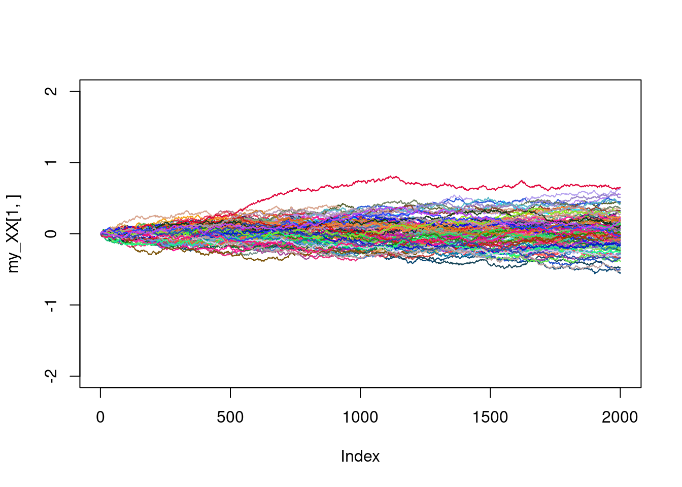
Not too bad. Are we able to simulate as well the large excursions ? Of course, there is no trajectories here with large excursions. Writing a model that makes this possible is beyond the scope of this tutorial.
Exercise: Simulate trajectories in dimension two.