Doctoral school course: an introduction to R
Block 3: Anova, dplyr, pipes, ggplot2…
The dataset
With base R
The ToothGrowth dataset contains the following variables:
- len: Tooth length (Dependent Variable)
- supp: Supplement type (VC = Vitamin C, OJ = Orange Juice)
- dose: Dosage level (0.5, 1, 2 mg/day)
We aim to test:
- If tooth length (len) differs based on supplement type (supp).
- If tooth length (len) differs based on dose (dose).
- If there is an interaction effect between supp and dose.
Let us load the data:
data("ToothGrowth")
str(ToothGrowth)
## 'data.frame': 60 obs. of 3 variables:
## $ len : num 4.2 11.5 7.3 5.8 6.4 10 11.2 11.2 5.2 7 ...
## $ supp: Factor w/ 2 levels "OJ","VC": 2 2 2 2 2 2 2 2 2 2 ...
## $ dose: num 0.5 0.5 0.5 0.5 0.5 0.5 0.5 0.5 0.5 0.5 ...Since the variable dose can take only three value, we
will consider that this varibale is categorical:
ToothGrowth$dose <- as.factor(ToothGrowth$dose) # Convert dose to a factor** Exercise:** Do the appropriate graphic for each variable.
One way to represent the problem on a same graph is the following,
using the attach function to access variables by their
namas and interaction to obtain a factor which represents
the interaction of the given factors:
attach(ToothGrowth)## Les objets suivants sont masqués depuis ToothGrowth (pos = 3):
##
## dose, len, supp## Les objets suivants sont masqués depuis ToothGrowth (pos = 4):
##
## dose, len, supp## Les objets suivants sont masqués depuis ToothGrowth (pos = 14):
##
## dose, len, suppboxplot(len~interaction(supp,dose),col=c("red","blue"))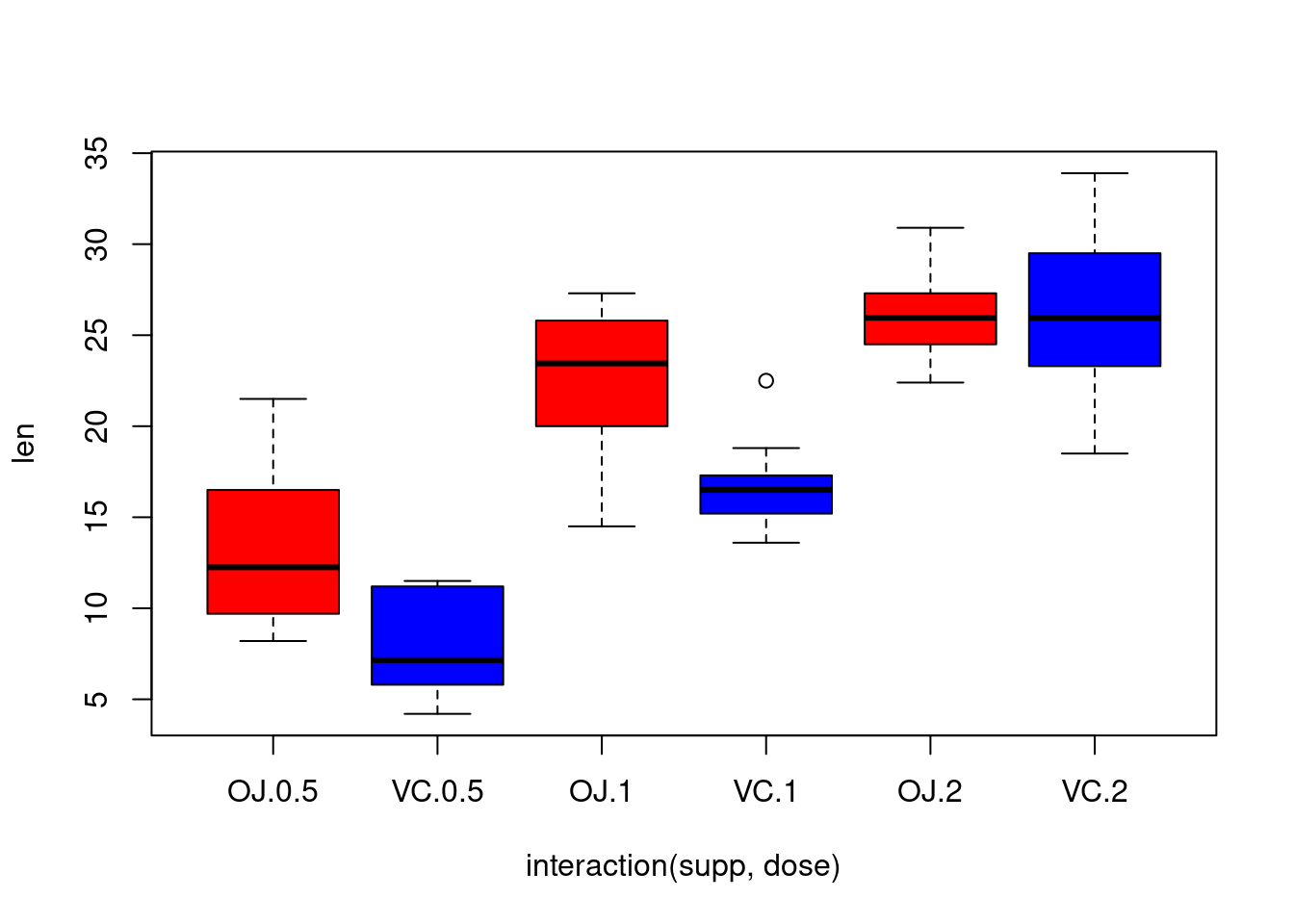
We can see that the length grows with the dose and that there is two
kind of effects of the supp dose (in mean, OJ
leads to higher tooth growth than VC for the dose levels
0.5 and 1, but to similar tooth growth of the
dose level \(2\), suggesting an
interaction between the two variables).
Exercise: Modify the code in order to obtain the
following graph:
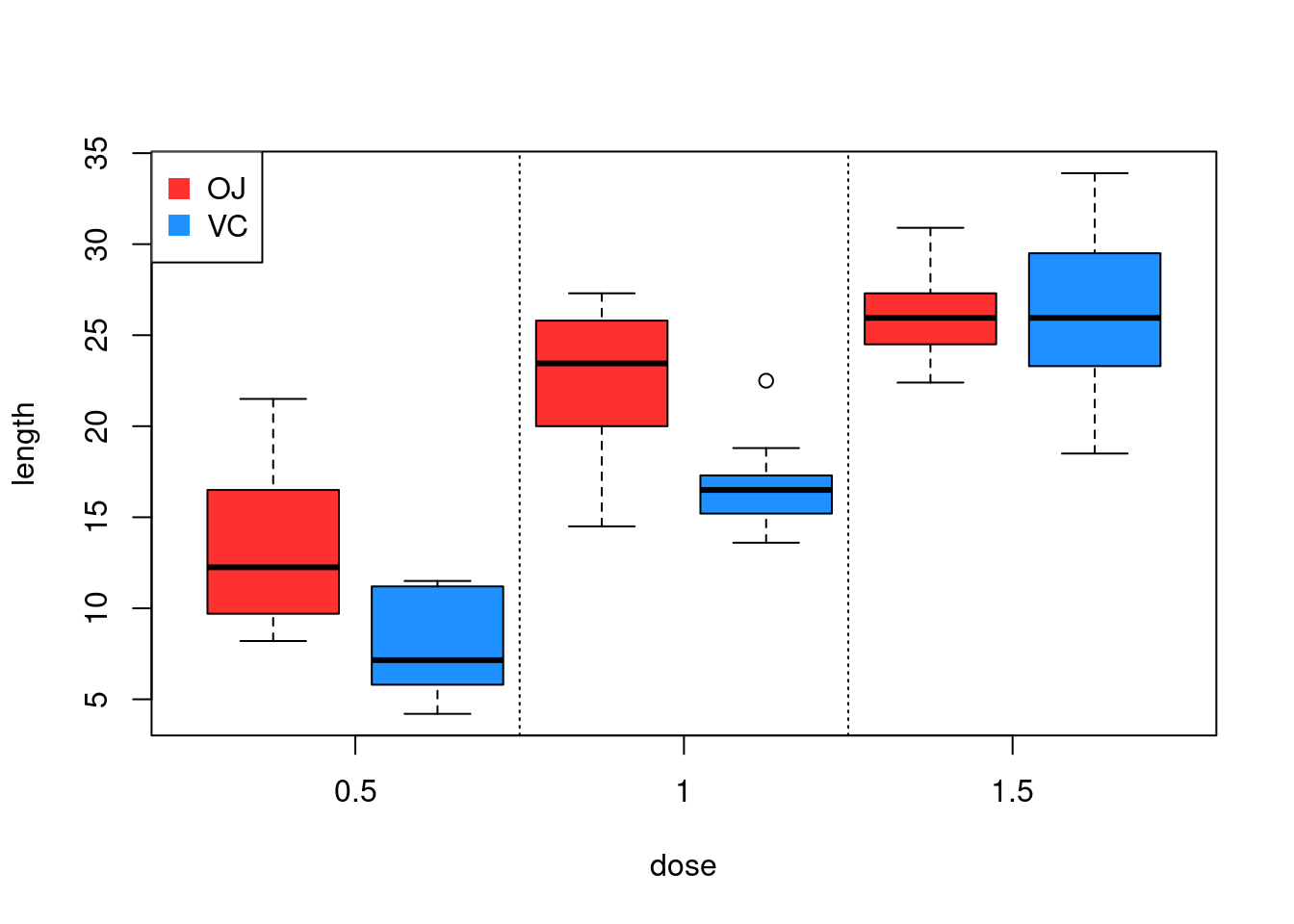
Exercise: How to obtain in R the number
of individuals for each levels of doseand
supp. And for the levels of
interaction(dose,supp) ?
With the library dplyr
The dplyr package is a user-friendly R library designed
for efficient data manipulation and transformation. It provides a set of
intuitive functions that simplify tasks such as selecting, filtering,
arranging, and summarizing data. Built on the concept of
tidy data, dplyr uses a consistent syntax with
pipes (%>%), allowing users to chain multiple operations
seamlessly. Some of its most commonly used functions include
select() for choosing specific columns,
filter() for subsetting rows, mutate() for
creating new variables, and summarize() for computing
summary statistics.
The pipe operator (%>%), widely used in
dplyr, allows for more readable and efficient code by
passing the output of one function directly as the input to the next.
Instead of nesting multiple functions inside each other, pipes create a
left-to-right workflow, improving code clarity (or suppose to…). For
example,
data %>% filter(var > 10) %>% select(var2, var3)
is maybe easier to read than
select(filter(data, var > 10), var2, var3). With the
introduction of native pipes (|>) in R 4.1,
users now have a built-in alternative, though %>% remains popular in
the tidyverse ecosystem.
Let us practive with our dataset. We can use select()
from dplyr to keep only relevant columns.
library(dplyr)
# Select only len and supp columns
tooth_selected <- ToothGrowth %>% select(len, supp)
head(tooth_selected)
## len supp
## 1 4.2 VC
## 2 11.5 VC
## 3 7.3 VC
## 4 5.8 VC
## 5 6.4 VC
## 6 10.0 VCOr with the built-in alternative operator |>:
tooth_selected <- ToothGrowth |> select(len, supp)
head(tooth_selected)
## len supp
## 1 4.2 VC
## 2 11.5 VC
## 3 7.3 VC
## 4 5.8 VC
## 5 6.4 VC
## 6 10.0 VCLet us tak a look at other basic functions. Filtering allows us to extract specific observations.
# Filter rows where dose is 1 mg
tooth_filtered <- ToothGrowth %>% filter(dose == 1)
head(tooth_filtered)
## len supp dose
## 1 16.5 VC 1
## 2 16.5 VC 1
## 3 15.2 VC 1
## 4 17.3 VC 1
## 5 22.5 VC 1
## 6 17.3 VC 1We can create new variables using mutate():
# Create a new column: Length category
tooth_modified <- ToothGrowth %>%
  mutate(len_category = ifelse(len > 20, "Long", "Short"))

head(tooth_modified)
## len supp dose len_category
## 1 4.2 VC 0.5 Short
## 2 11.5 VC 0.5 Short
## 3 7.3 VC 0.5 Short
## 4 5.8 VC 0.5 Short
## 5 6.4 VC 0.5 Short
## 6 10.0 VC 0.5 ShortSorting is useful for organizing data:
# Arrange data in descending order of len
tooth_sorted <- ToothGrowth %>% arrange(desc(len))
head(tooth_sorted)
## len supp dose
## 1 33.9 VC 2
## 2 32.5 VC 2
## 3 30.9 OJ 2
## 4 29.5 VC 2
## 5 29.4 OJ 2
## 6 27.3 OJ 1We can use group_by() and summarize() to
generate summary statistics:
group_by(ToothGrowth,dose, supp) %>%
  summarise(
    mean = round(mean(len, na.rm = TRUE)),
    sd = round(sd(len, na.rm = TRUE))
  )
## `summarise()` has grouped output by 'dose'. You can override using the
## `.groups` argument.## # A tibble: 6 × 4
## # Groups: dose [3]
## dose supp mean sd
## <fct> <fct> <dbl> <dbl>
## 1 0.5 OJ 13 4
## 2 0.5 VC 8 3
## 3 1 OJ 23 4
## 4 1 VC 17 3
## 5 2 OJ 26 3
## 6 2 VC 26 5Exercise: generate other basic statistics
(min, max, etc…)
Remark: You might have noticed that the output is a
tibble. A tibble is an improved version of a data frame in
R, introduced by the tibble package (part of
the tidyverse). It provides a more user-friendly and
consistent way to handle tabular data, improving on base R
data frames in several ways:
- Better Printing: Tibbles display only the first few rows and columns, preventing overwhelming outputs in large datasets.
- Preserves Data Types: Unlike data frames,
tibblesdo not automatically convert strings to factors. - Easier Subsetting: Tibbles prevent accidental row-name modifications and provide stricter subsetting behavior.
- Seamless Integration with dplyr: Designed to work efficiently with
dplyrand othertidyversetools.
Graphics with ggplot2
The library ggplot2 is a widely used data visualization
package for R:
library(ggplot2)It provides a structured approach to creating complex and
aesthetically pleasing visualizations with ease. Unlike base
R plotting functions, ggplot2 allows users to
build plots layer by layer.
Let us try to make a boxplot of the variable
len according to the dose for example:
ggplot(ToothGrowth, aes(x = dose, y = len)) +
geom_boxplot(fill = "dodgerblue", color = "black") +
labs(title = "Boxplot of len by dose",
x = "Dose",
y = "Length") +
theme_minimal()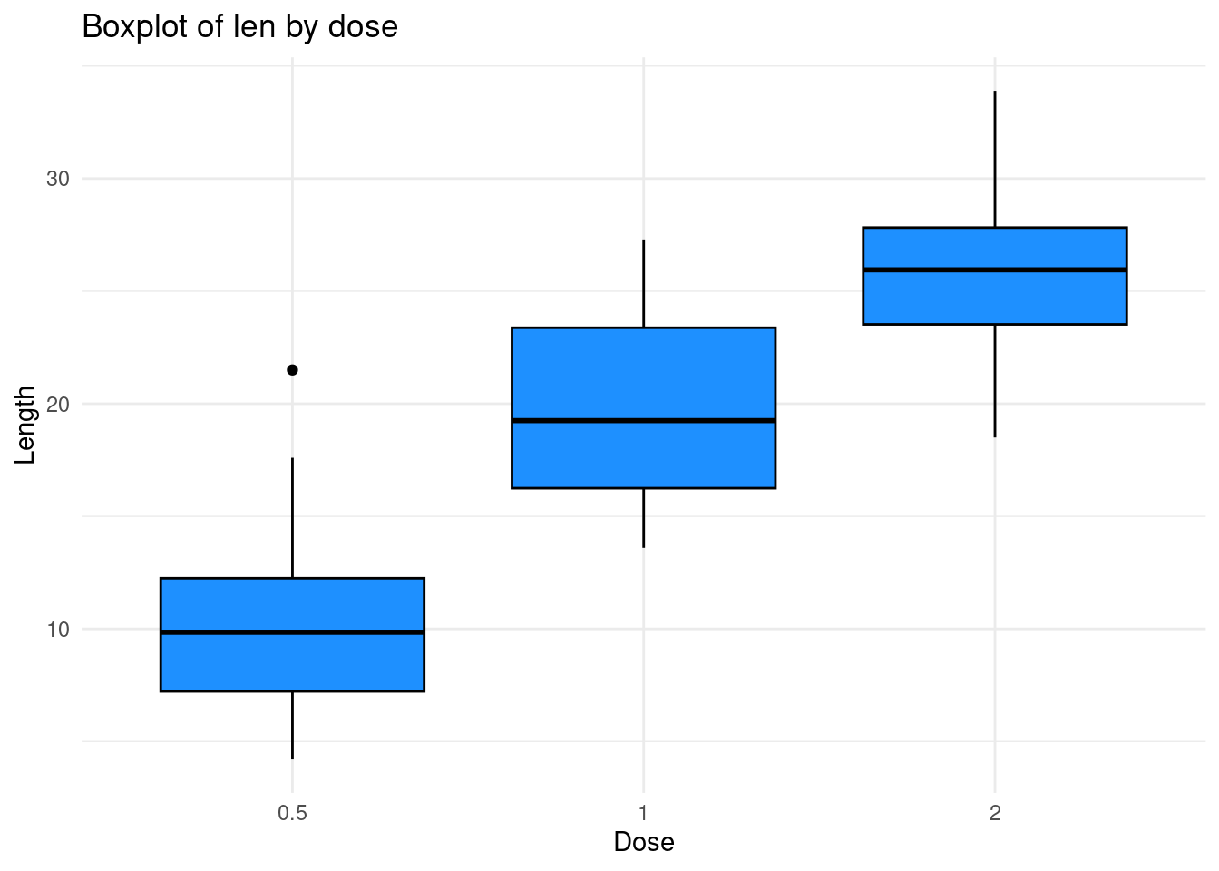 Here :
+add a layer to the plot.ggplot(ToothGrowth, aes(x = dose, y = len))Specifies the mtcars dataset and mapsdoseto the x-axis andlento the y-axis.geom_boxplot(fill = "dodgerblue", color = "black"): Creates the boxplot, with a light blue fill and black border.labs(...): Adds a title and labels for clarity.theme_minimal(): Applies a minimal theme to improve readability.
Remark that we can use a pipe |> instead of
+ at the first stage here. The syntax is as follows
ToothGrowth |>
  ggplot(aes(x = dose, y = len)) +
  geom_boxplot(fill = "dodgerblue", color = "black") +
  labs(title = "Boxplot of Length by Dose",
       x = "Dose",
       y = "Length") +
  theme_minimal()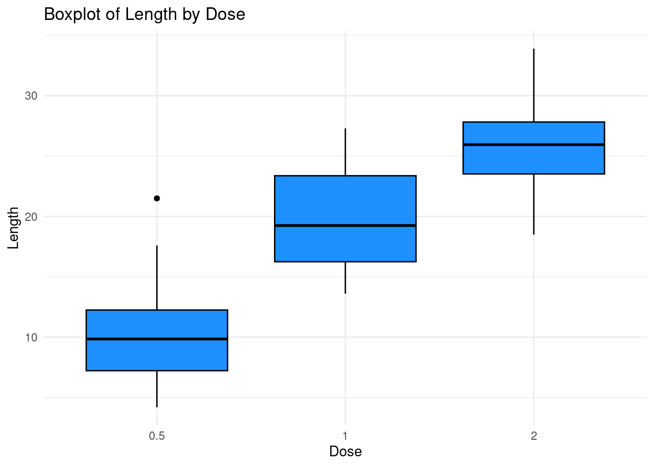
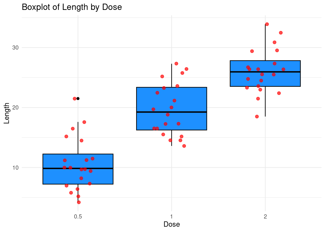
Exercise: Use the geom_jitter layer for
showing individual data points while avoiding overlap as in the graphic
just below:
 Now, turning to our question on the dataset, we can look at the
boxlplots of the length per dose and supplement while showing the means
for example:
ggplot(ToothGrowth, aes(x = dose, y = len)) +
  geom_boxplot(aes(fill = supp), alpha = 0.3, outlier.shape = NA) +  # Boxplot with transparency
  stat_summary(fun = mean, geom = "line", aes(group = supp, color = supp), size = 1) +  # Mean line by supp
  stat_summary(fun = mean, geom = "point", aes(color = supp), size = 3) +  # Mean points by supp
  scale_color_manual(values = c("VC" = "dodgerblue", "OJ" = "firebrick1")) +  # Mean line/point colors
  scale_fill_manual(values = c("VC" = "dodgerblue", "OJ" = "firebrick1")) +  # Boxplot fill colors
  labs(title = "Tooth Growth: Boxplot + Means",
       x = "Dose",
       y = "Tooth Length") +
  theme_minimal()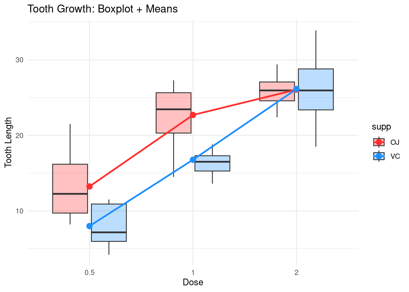
The syntax is not totally straightforward. Let us detail the one of
stat_summary:
stat_summary()is a statistical transformation in ggplot2 that allows you to summarize the data by applying a function, such as calculating the mean, median, or other summary statistics. It’s useful when you want to plot statistical summaries, like mean lines or bar heights, directly onto your plot.- The
funargument specifies the summary function to be applied to the data. In this case,meanis used to calculate the average of the y values (in this case, len), grouped by the x values (here, dose). This tells ggplot2 to calculate the mean for each group (in this case, per supp and dose). - The
geomargument determines what type of geometric object to use to display the summary statistic.linespecifies that the summary should be plotted as a line. In this case, it connects the mean points (calculated for each dose and supp) with a line. You can also use other geoms likepoint,bar, orerrorbarto visualize the summary in different forms. aes()defines the aesthetic mappings for the stat_summary().group = supp: Ensures that the data is grouped by the supp variable. This is necessary because supp defines the two categories (VC and OJ), and we want a separate line for each.color = supp: Specifies that the color of the line should be mapped to the supp variable, so you get different colors for each supplement type (VC and OJ).
- The
sizeargument controls the thickness of the line. In this case, size = 1 sets a standard thickness for the line.
The fact that the two mean lines converge is interpreted as an
interaction effect between dose and supp.
Two-way anova
Remark: We already saw an example of one-way anova in Block 2.
The sum of squares
One way to investigate the effect of the variables supp
and dose on the variable len is to perform an
anova:
anova_result <- aov(len ~ supp * dose, data = ToothGrowth)
summary(anova_result)
## Df Sum Sq Mean Sq F value Pr(>F)
## supp 1 205.4 205.4 15.572 0.000231 ***
## dose 2 2426.4 1213.2 92.000 < 2e-16 ***
## supp:dose 2 108.3 54.2 4.107 0.021860 *
## Residuals 54 712.1 13.2
## ---
## Signif. codes: 0 '***' 0.001 '**' 0.01 '*' 0.05 '.' 0.1 ' ' 1An anova is an “analysis of variance”, let us quote from Wikipedia:
used to compare the means of two or more groups by analyzing variance. Specifically, ANOVA compares the amount of variation between the group means to the amount of variation within each group. If the between-group variation is substantially larger than the within-group variation, it suggests that the group means are likely different.
This is not directly the variance that is generally considered but the sum of squares, which is the variance times the number of individuals.
We can compute the variance of the mean of len knowing
the supp (mathematically \(\mathbb{V}(\mathbb{E}(L|S))\)). For the sum
of squares, it corresponds to compute:
nb_per_group_supp<-unique(table(supp))
Squares_supp<-nb_per_group_supp*((mean(len[supp=="VC"])-mean(len))^2+(mean(len[supp=="OJ"])-mean(len))^2)
Squares_supp
## [1] 205.35Indeed, in a probabilistic way: \[\begin{align*} \mathbb{V}(\mathbb{E}(L|S))&=\mathbb{E}((\mathbb{E}(L|S)-\mathbb{E}(\mathbb{E}(L|S)))^2)\\ &=\mathbb{E}((\mathbb{E}(L|S)-\mathbb{E}(L))^2)\\ &=(\mathbb{E}(L|S)_{S={\rm VC}}-\mathbb{E}(L))^2\mathbf{P}(S={\rm VC})+(\mathbb{E}(L|S)_{S={\rm OJ}}-\mathbb{E}(L))^2\mathbf{P}(S={\rm OJ}) \end{align*}\] Here there is a simplification since in our case \(\mathbb{P}(S={\rm OJ})=\mathbb{P}(S={\rm VC})\) (it explains the factorisation in the code).
If you prefer, in a statistical way: \[ \bigg(\frac{1}{n_{VC}}\sum_{i,~S_i=VC}L_i-\bar{L}_n\bigg)^2\frac{n_{VC}}{n}+\bigg(\frac{1}{n_{OJ}}\sum_{i,~S_i=OJ}L_i-\bar{L}_n\bigg)^2\frac{n_{OJ}}{n} \] This is the variance of the conditional mean.
In the same way, the sum of squares related to \(\mathbb{V}(\mathbb{E}(L|D)\) is
nb_per_group_dose<-unique(table(dose))
Squares_dose<-nb_per_group_dose*((mean(len[dose=="0.5"])-mean(len))^2
    +(mean(len[dose=="1"])-mean(len))^2
    +(mean(len[dose=="2"])-mean(len))^2)
Squares_dose
## [1] 2426.434We can also compute the sum of squares related to \(\mathbb{V}(\mathbb{E}(L|(S,D))\), that is the variance of the length knowing both the dose and the supplement (there is \(10\) individuals for each interaction levels here):
Squares_between<-10*((mean(len[(supp=="VC")&(dose=="0.5")])-mean(len))^2
    +(mean(len[(supp=="VC")&(dose=="1")])-mean(len))^2
    +(mean(len[(supp=="VC")&(dose=="2")])-mean(len))^2
    +(mean(len[(supp=="OJ")&(dose=="0.5")])-mean(len))^2
    +(mean(len[(supp=="OJ")&(dose=="1")])-mean(len))^2
    +(mean(len[(supp=="OJ")&(dose=="2")])-mean(len))^2
)
Squares_between
## [1] 2740.103We then compute \[ \mathbb{V}(\mathbb{E}(L|(S,D))-\mathbb{V}(\mathbb{E}(L|S)-\mathbb{V}(\mathbb{E}(L|D) \] to obtain the sum of squares only related to the interaction between \(S\) and \(D\):
#Sinteract
Squares_interaction<-Squares_between-Squares_dose-Squares_supp
Squares_interaction
## [1] 108.319The residuals is what we have left until now:
Squares_residuals<-sum((len-mean(len))^2)-Squares_interaction-Squares_dose-Squares_supp
Squares_residuals
## [1] 712.106This means that the squares of the residuals is in fact \(\mathbb{E}(\mathbb{V}(L|(S,D)))\) since we always have the following decomposition of variance \[ \mathbb{V}(L)=\mathbb{E}(\mathbb{V}(L|(S,D)))+\mathbb{V}(\mathbb{E}(L|(S,D))). \]
The Df in the anova table are given:
- for
dose: the number of levels minus \(1\), that is: \(2-1=1\). - for
supp: the number of levels minus \(1\), that is: \(3-1=2\). - for
supp:dose(the interaction): the number of levels of the interaction (\(6\)) minus the number of levels ofdoseandsup$, plus \(1\), that is: \(6-2-3+1=1\).
Then, the means of the squares appears in the third column
(Mean Sq: that is Sum Sq divided by
Df):
summary(anova_result)## Df Sum Sq Mean Sq F value Pr(>F)
## supp 1 205.4 205.4 15.572 0.000231 ***
## dose 2 2426.4 1213.2 92.000 < 2e-16 ***
## supp:dose 2 108.3 54.2 4.107 0.021860 *
## Residuals 54 712.1 13.2
## ---
## Signif. codes: 0 '***' 0.001 '**' 0.01 '*' 0.05 '.' 0.1 ' ' 1In the fourth colum are the F-values corresponding Fisher statistics:
this is the Mean Sq of the considered factor divided by the
Mean Sq of the residuals. This is statistics associate to
the null hypotheses: no effect of the dose, the supp or no effect of the
interaction. Here there is a clear effect of dose and supp, and some
effect of the interaction (as suggested by the graphics).
The model
We have not yet given the underlying statistical model: \[ L_{ijk}=\alpha_i+\beta_j+\gamma_{ij}+\epsilon_{ijk} \] which means that the tooth length of an individual numbered \(k\) having received dose \(i\) and supplement \(j\) is the sum of the effect of the dose \(i\) (the \(\alpha_i\)), the effect of the supplement \(j\) (the \(\beta_j\)) and the effect of an interaction between the levels \(i\) of the dose and \(j\) of the supplement (the \(\gamma_j\)). The \(\epsilon_{ijk}\) accounts for the variability of the individual, which is assumed to follow a normal law with variance \(\sigma^2\) (independent of \(i\) and \(j\)). (There is other constraints on the parameters in fact…) The anova we have performed tells us that we can keep \(\alpha\), \(\beta\) and \(\gamma\) in the model.
Can we check that the residuals are indeed normally distributed ? Let
us built the model in R:
reg<-lm(len ~ supp * dose, data = ToothGrowth)
summary(reg)
##
## Call:
## lm(formula = len ~ supp * dose, data = ToothGrowth)
##
## Residuals:
## Min 1Q Median 3Q Max
## -8.20 -2.72 -0.27 2.65 8.27
##
## Coefficients:
## Estimate Std. Error t value Pr(>|t|)
## (Intercept) 13.230 1.148 11.521 3.60e-16 ***
## suppVC -5.250 1.624 -3.233 0.00209 **
## dose1 9.470 1.624 5.831 3.18e-07 ***
## dose2 12.830 1.624 7.900 1.43e-10 ***
## suppVC:dose1 -0.680 2.297 -0.296 0.76831
## suppVC:dose2 5.330 2.297 2.321 0.02411 *
## ---
## Signif. codes: 0 '***' 0.001 '**' 0.01 '*' 0.05 '.' 0.1 ' ' 1
##
## Residual standard error: 3.631 on 54 degrees of freedom
## Multiple R-squared: 0.7937, Adjusted R-squared: 0.7746
## F-statistic: 41.56 on 5 and 54 DF, p-value: < 2.2e-16and then take a look at the residuals:
resid<-residuals(reg)
resid_norm<-(resid-mean(resid))/sd(resid)
hist(resid_norm,freq=F)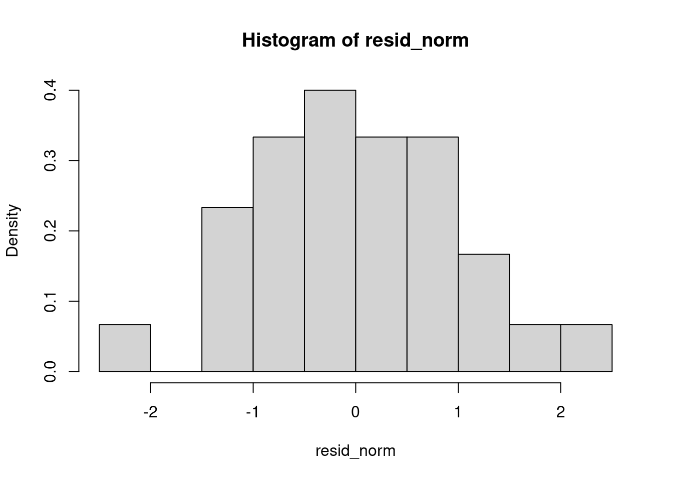
It’s shaped like a bell curve… Let’s do a test to confirm.
shapiro.test(resid_norm)##
## Shapiro-Wilk normality test
##
## data: resid_norm
## W = 0.98499, p-value = 0.6694The p-value is quite high: it tends to say that the redisuals do follow a normal law.
And at last, a qq-plot:
qqplot(resid_norm,rnorm(1000,0,1))
abline(a=0,b=1)
Not too bas too…
Tukey test
The Tukey test, also known as Tukey’s Honest Significant Difference (HSD) test, is a statistical method used for multiple comparison procedures in ANOVA (Analysis of Variance). It helps determine which specific group means are significantly different from each other after finding a significant overall effect in ANOVA. The test controls the family-wise error rate to reduce the likelihood of false positives when comparing multiple groups. It calculates the HSD value, which is the minimum difference between means required for statistical significance, using the studentized range distribution. The Tukey test is particularly useful when comparing all possible pairs of means and is widely applied in experimental research to validate differences between treatment groups.
In R, you do this test as follows:
tukey_results <- TukeyHSD(anova_result)
tukey_results
## Tukey multiple comparisons of means
## 95% family-wise confidence level
##
## Fit: aov(formula = len ~ supp * dose, data = ToothGrowth)
##
## $supp
## diff lwr upr p adj
## VC-OJ -3.7 -5.579828 -1.820172 0.0002312
##
## $dose
## diff lwr upr p adj
## 1-0.5 9.130 6.362488 11.897512 0.0e+00
## 2-0.5 15.495 12.727488 18.262512 0.0e+00
## 2-1 6.365 3.597488 9.132512 2.7e-06
##
## $`supp:dose`
## diff lwr upr p adj
## VC:0.5-OJ:0.5 -5.25 -10.048124 -0.4518762 0.0242521
## OJ:1-OJ:0.5 9.47 4.671876 14.2681238 0.0000046
## VC:1-OJ:0.5 3.54 -1.258124 8.3381238 0.2640208
## OJ:2-OJ:0.5 12.83 8.031876 17.6281238 0.0000000
## VC:2-OJ:0.5 12.91 8.111876 17.7081238 0.0000000
## OJ:1-VC:0.5 14.72 9.921876 19.5181238 0.0000000
## VC:1-VC:0.5 8.79 3.991876 13.5881238 0.0000210
## OJ:2-VC:0.5 18.08 13.281876 22.8781238 0.0000000
## VC:2-VC:0.5 18.16 13.361876 22.9581238 0.0000000
## VC:1-OJ:1 -5.93 -10.728124 -1.1318762 0.0073930
## OJ:2-OJ:1 3.36 -1.438124 8.1581238 0.3187361
## VC:2-OJ:1 3.44 -1.358124 8.2381238 0.2936430
## OJ:2-VC:1 9.29 4.491876 14.0881238 0.0000069
## VC:2-VC:1 9.37 4.571876 14.1681238 0.0000058
## VC:2-OJ:2 0.08 -4.718124 4.8781238 1.0000000This is a little bit difficult to read… We have the difference of the means in the first column, then lower and upper bound for the corresponding confidence interval and then the p-value related to the test with null hypothesis: the means are the same.
A common approach to simplify the interpretation consists in assigning letters to groups such that :
- Groups sharing the same letter are not significantly different.
- Groups with different letters are significantly different.
We can use the package multcompView to do that:
library(multcompView)
tukey_dose <- tukey_results$`supp:dose`
# Convert p-values into groupings
letters_df <- multcompLetters(tukey_dose[,4])$Letters  # Extract group letters

# Display results
print(letters_df)
## VC:0.5 OJ:1 VC:1 OJ:2 VC:2 OJ:0.5
## "a" "b" "c" "b" "b" "c"And then, we can represent the means and the letters for the interaction factorial variable on the same graph:
# Create a summary dataframe with means & standard errors
summary_df <- ToothGrowth %>%
  group_by(supp, dose) %>%
  summarize(
    mean_len = mean(len),
    se = sd(len) / sqrt(n())
  ) %>%
  ungroup()
## `summarise()` has grouped output by 'supp'. You can override using the
## `.groups` argument.# Add Tukey letters to summary dataframe
summary_df$group <- letters_df
# Create a bar plot
ggplot(summary_df, aes(x = interaction(supp, dose), y = mean_len, fill = supp)) +
geom_bar(stat = "identity", position = "dodge", width = 0.6) +
geom_errorbar(aes(ymin = mean_len - se, ymax = mean_len + se), width = 0.2) +
geom_text(aes(label = group, y = mean_len + se + 1), size = 5) + # Add letters above bars
theme_minimal() +
labs(x = "Supplement & Dose", y = "Mean Tooth Length", title = "Tukey HSD Test Results") +
theme(legend.position = "none")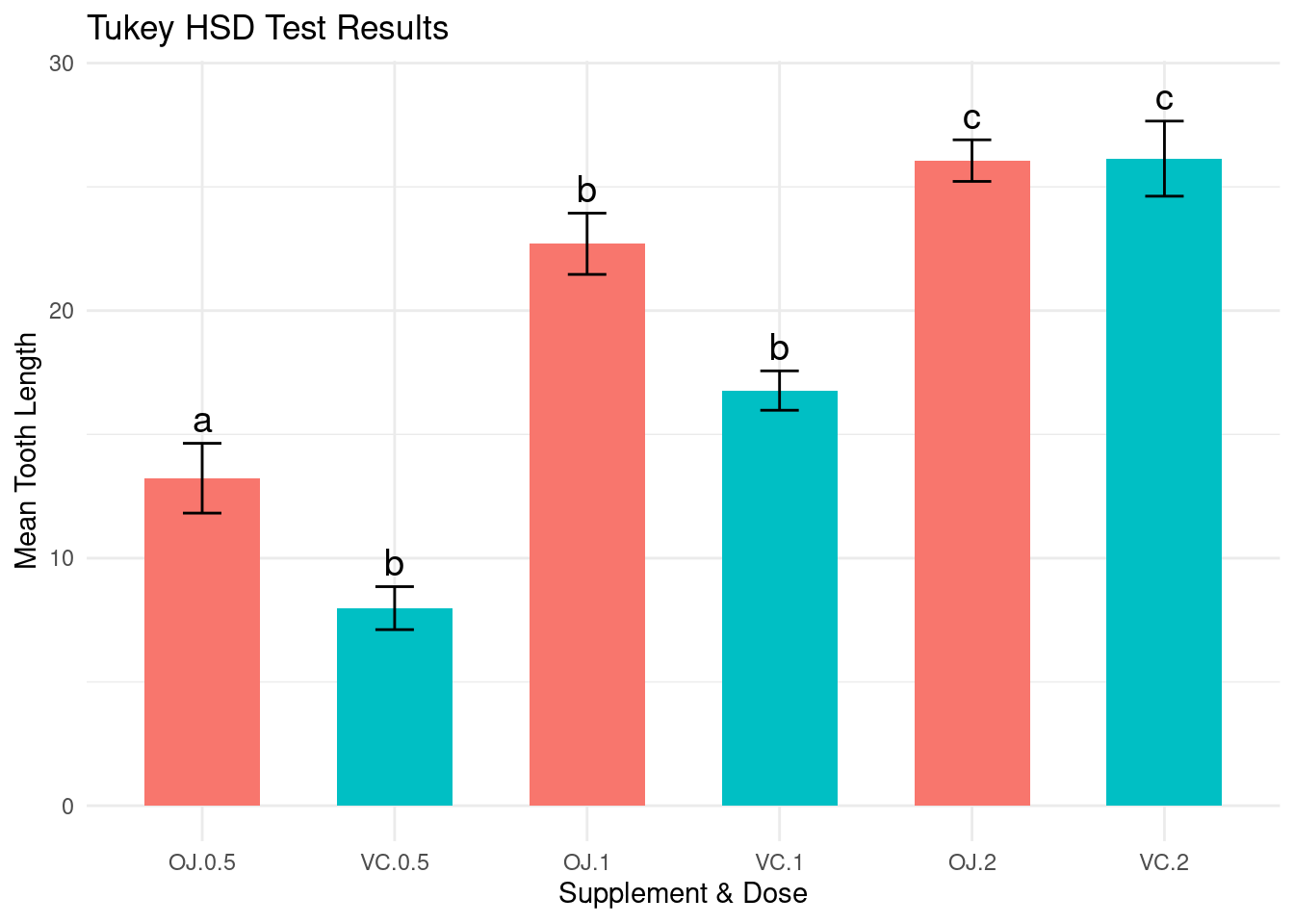
Saving files and plots
I realize that we have not learned how to save data and graphics…
Saving and Loading R Objects
The .RData format allows saving multiple objects in a
single file as follows:
# Creating example objects
a <- 10
b <- data.frame(x = 1:5, y = rnorm(5))

# Save objects
save(a, b, file = "example.RData")

# Remove objects from environment
rm(a, b)

# Load objects back
load("example.RData")
The .rds format is useful when saving a single
R object.
# Save object
saveRDS(b, file = "data.rds")

# Remove object
rm(b)

# Load object
b <- readRDS("data.rds")
Exercise:
- Create a vector of 100 random numbers.
- Save it in both .RData and .rds formats.
- Remove and reload them to check functionality.
Saving Data in Other Formats
For csv files:
# Write to CSV
write.csv2(b, file = "data.csv", row.names = FALSE)

# Read from CSV
b_csv <- read.csv2("data.csv")
For Excel Files (Using openxlsx):
# Install package if not installed
library(openxlsx)

# Write to Excel
write.xlsx(b, file = "data.xlsx")

# Read from Excel
b_xlsx <- read.xlsx("data.xlsx")
Exercise:
- Save the mtcars dataset in CSV and Excel formats.
- Reload them and verify if the data matches the original.
Saving Graphics
As a png file:
# Create a plot and save it
png("plot.png", width = 800, height = 600)
plot(mtcars$mpg, mtcars$hp, main = "MPG vs HP")
dev.off()
## png
## 2As a pdf file:
pdf("plot.pdf")
plot(mtcars$mpg, mtcars$hp, main = "MPG vs HP")
dev.off()
## png
## 2As a jpeg file:
jpeg("plot.jpg", width = 800, height = 600)
plot(mtcars$mpg, mtcars$hp, main = "MPG vs HP")
dev.off()
## png
## 2Exercise:
- Create a histogram of a numeric variable.
- Save it in PNG, PDF, and JPEG formats.
Exercise:
- Create a scatter plot of
iris$Sepal.Lengthvs.iris$Sepal.Widthfrom theirisdataset. - Save it in PNG and PDF formats.
- Save the iris dataset in
.rdsand.csvformats.
Leaflet
Leaflet is an open-source JavaScript library for interactive maps. The R package leaflet provides bindings to this library, making it easy to create interactive maps in R.
Ensure you have installed the necessary package by running:
#if needed:
#install.packages("leaflet")
Load the package:
library(leaflet)Basic map creation
A simple map with a default tile layer can be created using:
leaflet() %>%
  addTiles() %>%
  setView(lng = -122.4194, lat = 37.7749, zoom = 10) # San Francisco, CA
Explanation:
leaflet(): Initializes the map.addTiles(): Adds the default OpenStreetMap tile layer.setView(): Centers the map on given latitude and longitude with a specified zoom level.
Exercise: Modify the above code to center the map on your place of birth with a zoom level of 12.
Exercise: Find what are the possible (free) other tiles and change it.
Exercise: Add a search tool using the
addSearchOSM function from the leaflet.extras
library.
Adding markers
Markers allow you to highlight locations:
leaflet() %>%
  addTiles() %>%
  addMarkers(lng = -122.4194, lat = 37.7749, popup = "San Francisco")
You can add multiple markers dynamically using a data frame:
cities <- data.frame(
  name = c("San Francisco", "Los Angeles", "Chicago"),
  lat = c(37.7749, 34.0522, 41.8781),
  lng = c(-122.4194, -118.2437, -87.6298)
)

leaflet(cities) %>%
  addTiles() %>%
  addMarkers(~lng, ~lat, popup = ~name)
Exercise: Add an additional city (e.g., Miami) to the data frame and update the map.
You can use custom icons:
library(leaflet)
customIcon <- makeIcon(
  iconUrl = "https://upload.wikimedia.org/wikipedia/commons/8/88/Map_marker.svg",
  iconWidth = 25, iconHeight = 41
)

leaflet() %>%
  addTiles() %>%
  addMarkers(lng = -122.4194, lat = 37.7749, icon = customIcon, popup = "Custom Icon!")
Exercise: Find a different icon online and use it in place of the provided one.
Polygons allow you to highlight areas:
leaflet() %>%
  addTiles() %>%
  addPolygons(
    lng = c(-122.5, -122.3, -122.3, -122.5),
    lat = c(37.7, 37.7, 37.9, 37.9),
    color = "blue",
    fillColor = "lightblue",
    fillOpacity = 0.5
  )
Exercise: Modify the above polygon to cover a different region.
To highlight regions using circles and rectangles:
leaflet() %>%
  addTiles() %>%
  addCircles(lng = -122.4194, lat = 37.7749, radius = 500, color = "red") %>%
  addRectangles(
    lng1 = -122.5, lat1 = 37.7,
    lng2 = -122.3, lat2 = 37.9,
    color = "green"
  )
Foraging data
Download the following gps data describing foraging seabird’s trajectories form this study :
Santos CD, Campos LFAS, Efe MA. 2018. Data from: Foraging habitat choice of white-tailed tropicbirds revealed by fine-scale GPS tracking and remote sensing. Movebank Data Repository. https://doi.org/10.5441/001/1.649s6f21
seabirds<-read.csv2("Foraging.csv",sep=",")
View(seabirds)
Change the format for the numerical variables:
seabirds$location.long<-as.numeric(seabirds$location.long)
seabirds$location.lat<-as.numeric(seabirds$location.lat)
You can obtain the trace of all the seabirds as follows:
leaflet(seabirds) %>%
  addTiles() %>%
  addPolylines(~location.long, ~location.lat)
But when we look at the
seabirds$individual.local.identifier, we remark that there
is several individuals.
Exercise: obtain the trace of each individual by changing the colours.